Searchspring recently hosted a webinar called the Black Friday / Cyber Monday Checklist featuring our own Jason Ferrara, Jenna Galardi from BigCommerce, and Keval Baxi from Codal. While the intent of this webinar was to discuss Black Friday / Cyber Monday site readiness, we quickly realized that the discussion we were having applies year-round. Whether you’re preparing for back-to-school, a semi-annual sale, or just want to make sure your site is delivering the best possible shopper experience, these ecommerce site best practices will help guide you to more conversions and create a happy, loyal customer base.
This article includes many of the topics discussed in the Black Friday / Cyber Monday Checklist webinar, but we wanted to take it a few steps further to ensure we provide you – Searchspring’s customers – the best experience possible.
Ecommerce Site Best Practices
Ecommerce Site Design and Content
Ever gone to a website and bounced because it didn’t look professional or felt overwhelming? Almost everyone has. A well-designed and laid-out ecommerce site is key to reaching your goals.
The first thing to do is put yourself in the end-users (your shopper’s) shoes and experience it how they experience it.
A great way to get started is to have family and friends shop your site. We’ll get into how to conduct a site audit a little later, but having people from outside your organization shop your site helps you understand what’s working and what isn’t. In relation to site design and content, they can tell you if messaging isn’t clear, how easy or difficult it is to find information, and describe their experience discovering relevant products.
The Importance of UX
UX, or User Experience, should be the #1 priority when thinking through your ecommerce site design strategy. A great user experience equates to a great shopper experience, and a great shopper experience leads to more conversions.
The simple goal is to make it as easy as possible for shoppers to navigate your site and discover relevant products. We achieve this goal by always keeping the end-user (the shopper) in mind.
So, let’s take it from the top and work through your site.
What Should Go on the Homepage?
When designing your ecommerce site, a good rule of thumb is that less is more. If there’s too much to look at, shoppers get lost – and so does your primary objective.
-
Clear Call-to-Action
The first thing shoppers should see on your homepage is a Call to Action (CTA). CTA’s tell shoppers what action they should take on your page and help you reach your goals. While defining your goals, ask the following questions:
- What action do you want visitors to take? Why?
- Is this clear to the end-user?
- How easy is it for visitors take action on the CTA?
- What happens after they click the CTA? Where do they land?
Your CTA needs to be clean, simple, and obvious with an easy path to purchase. The less clicks a shopper needs to take to get to what they’re looking for, the better.
The store for anime site, Crunchy Roll, wants shoppers to shop their Junji Ito collection. They have the collection featured on the homepage with clear “Shop Now” messaging and creative. After a user clicks “Shop Now”, they land on a page with Junji Ito products.
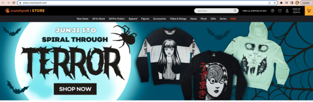
Crunchy Roll Has a Clear “Shop Now” CTA on Their Homepage
How to Decide What Products to Feature on Your Homepage
Of course, you wdon’t have much of an ecommerce site if you don’t feature products on your homepage. So the question becomes, how do you decide what should go in this prime real estate?
-
Sales and Promotions
If promoting a big sale (such as Black Friday, a BOGO promo, or Mother’s Day), put this creative first. It’s likely that many shoppers are visiting your site specifically for these promotions, so put them front and center to ensure they find what they’re looking for quickly and easily. Link to specially created campaign landing pages so shoppers can find relevant products.
Children’s shoe brand, Stride Rite, gives us a perfect example of a clean, easy-to-navigate homepage. The first thing shoppers see is their current Buy 2 Pairs, Get 50% Off Sale Sneakers promotion. The simple design and clear messaging immediately tells shoppers what they should do: Click the “Shop Now” CTA.
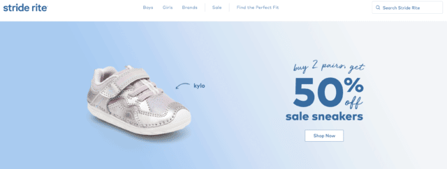
Stride Rite Homepage
After shoppers click “Shop Now”, they land on a campaign page that easily lets them add filters to narrow down their selection even more.
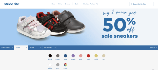
Stride Rite Campaign Landing Page Showing Filter by Color
-
Ecommerce Personalized Product Recommendations
Because your homepage is likely the first page loyal customers land on (after all, it’s probably in their history or bookmarked), curate an experience that’s just for them through Personalized Product Recommendations.
Ecommerce personalized product recommendations displays products based on each individual shoppers search, browsing, and purchase history. Beyond the homepage, use recommendations to promote complimentary and similar products, and additional items the customer might be interested in based on previous purchases and what other customers bought.
Look at personalization this way: it’s the closest experience a shopper can get to visiting a brick-and-mortar location. When shopping in-store, they’re met with a warm welcome and receive assistance from a sales associate based on their needs. We get to know them. There’s no reason not to duplicate this level of service online, and the way to do that is to personalize as much as possible. Make the customer feel special and understood, and you create a customer for life.
Jonathan Adler is a brand that is serious about design – and serious about providing a stellar shopper experience. By leveraging personalization, Jonathan Adler guides shoppers to products they’re more likely to purchase and helps them easily find products that fit their individual needs.
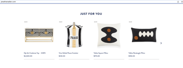
Jonathan Adler Personalized Product Recommendations on Homepage
-
Product Category Pages
An obvious choice for the homepage is product categories. Shoppers who don’t use search need a simple way to narrow down what they’re looking for. The truth is, they may not even know what they want, so it’s up to you to help them decide. Create clear categories so visitors don’t have to think too hard about what each one means. From there, create category pages and utilize boost rules and inline banners to promote best sellers, exclusive products, and promotions.
As the biggest name in faucets in the United States, Moen has a huge responsibility to make sure the right product gets in front of the right shopper. Visitors to their site are extremely likely to be comparing products and determining their needs. Faucets aren’t something most people purchase everyday, so clarity is important.
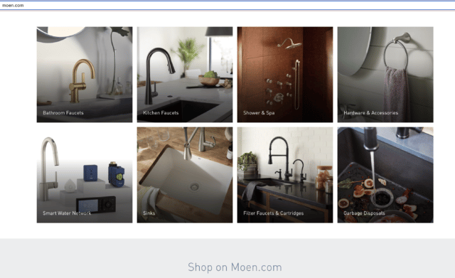
Moen Product Categories on Homepage
-
Best Sellers and Trending Products
You may also want to include best sellers and trending products on your homepage. Featuring best sellers and trending products puts value on these items and lets shoppers know what is hot.
Just like we discover new things through trending topics on Twitter, visitors to your ecommerce site discover new products through best selling and trending items. This can be especially helpful for visitors looking for gifts.
You don’t think a certain pop-star turned billionaire business woman got to where she is by not understanding what people want, do you? Of course not. Savage Fenty X gives the people what they want by putting trending products in the spotlight.
So how do they determine what is trending? Through insights. Insights and data help Savage Fenty X understand their audience and anticipate their needs. They can also see what visitors search for and what category and product pages they are browsing.
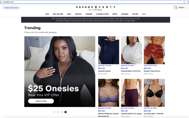
Savage Fenty X Trending Products on Homepage
Ecommerce Site Search
It’s a fact that shoppers who use on-site search are 4x more likely to convert. Those who use search come to your site with a purpose and they know what they want. That’s why it’s so important your search functionality is easy to find, designed well, and, most importantly, returns relevant results.
Use the following tips for search bar best practices:
- Top, front, and center placement
- Make your ecommerce search bar stand out
- Easy to find
- Add a “Search” button
- Embrace white space
- Use helpful placeholder text
- Make sure it’s mobile friendly and accessible
- Implement predictive search results, Autocomplete, spell corrections, and synonyms
Native ecommerce platforms have built-in search, however as your site grows, a more powerful solution is necessary. An ecommerce site search tool, like Searchspring, integrates with your online store to optimize search results.
During the Black Friday / Cyber Monday Checklist webinar, Jenna Galardi noted that using available technology to optimize your site is a no-brainer.
“If you’re not [already using Searchspring], why not? That’s really how you optimize your site. You want to make sure that you’re showing the right product to the right people. If they’re searching for something and they’re misspelling, using the wrong name, and they aren’t finding the product that they’re looking for, instead of trying to re-invent the wheel, use the most amazing technology that already exists.”
– Jenna Galardi, Senior Omnichannel Growth Manager, BigCommerce
1800wheelchair makes it their mission to fill the mobility void. Knowing that mobility equipment users benefit from online shopping, they understand the importance search on their site. Their search bar is front and center at the top of their page so users can easily find it. When shoppers utilize the search function, it doesn’t take long before relevant suggestions are auto-populated.
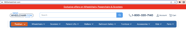
1800wheelchair’s Search Bar is Front and Center on Their Homepage
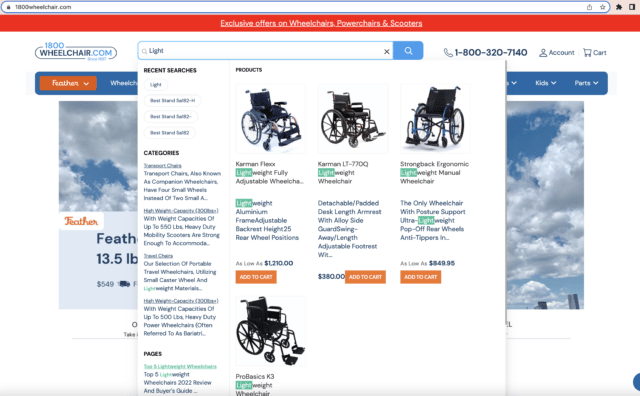
Autocomplete on 1800wheelchair’s Site
Having great on-site search also helps improve SEO if you use it correctly. With easy-to-read Site Search Insights and Data, you can take immediate action to boost your rankings. Use search insights in the following ways:
- Perform keyword research and update site copy, synonyms, and paid ads accordingly
- Identify gaps in content
- Improve your online store’s user experience
- Optimize Search Engine Results Page (SERP)
- Create sitelinks search boxes
Navigation and Footer
The navigation and footer of your ecommerce store are super important. They aren’t just on the homepage, they follow visitors throughout the site. Both should be short, simple, and provide clear information.
While each site’s navigation and footer varies by company, they should always be created with the end-user in mind.
- Words Matter: Use words that are universally known. These are not the spots to use terms that are only known to your inner-circle.
- Keep It Short: One or two word descriptive titles.
- Less is More: The less busy the navigation and footer look, the better. Don’t jam in categories. Create drop-downs as needed instead.
- Logo Linkage: In both the navigation and the footer, link your store’s logo to the homepage.
As noted above, each store’s footer will vary, but there are a few things that should, without-a-doubt, be included:
- FAQ
- About
- Contact Info
- Store Hours (where applicable)
- Privacy Policy and Copyright Info
- Social Media Icons (linked)
- Email Sign Up Form
Australian retailer, The Upside keeps their navigation and footer simple and informative so shoppers can find what they need without hassle.
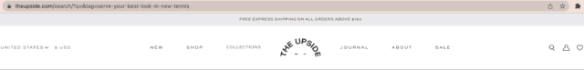
The Upside’s Simple, Yet Descriptive Navigation
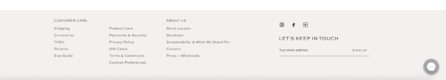
The Upside’s Footer Includes a Chat Function for Quick Customer Support
What Should Go on Product Detail Pages?
Product detail pages are where the magic really happens. This is your chance to let the product shine and provide information that leads shoppers to click “add to cart”.
So what’s the key to creating product pages that convert? We may seem like a broken record at this point, but it’s keeping the end-user in mind.
What do shoppers want to see? What do they need to know? Keeping your audience in mind is the difference between a bounce and buy.
One of the most important things you can do when designing product detail pages is use high-quality images – and plenty of them. Show all angles and include images of the product on it’s own and in-use. For example, if your ecommerce site sells vases, show them on a table or next to a couch so shoppers can easily see its size. If you sell purses, show a person holding it and the various ways to style it (crossbody, sling, backpack, straps). This helps demonstrate where the bag sits on the body and its size.
A great way to showcase your products is through video. Video helps shoppers see movement, examine material, and determine if the product fits into their vision. While choosing your photo and video esthetic, consider all the channels your online store has a presence on and the requirements for each. Social media, third-party marketplaces, influencer pages, and traditional marketing materials like mailers, all have different background, size, and use-case requirements.
The product detail page is is where you make the sale, so sell it. Give a concise, well-written product description that shoppers can scan. Include bullet points as needed. Share dimensions, materials, care instructions, sustainability, and any other important points that apply to the item. Remember to also include keywords in your product description (but be careful not to fall victim to keyword stuffing). Crafting the right copy gives your SEO a boost and helps your rankings.
If the item comes in various colors, prints, or sizes, the product page should include this info, along with the option to click through with images.
Ecommerce sites that also have brick-and-mortar stores and offer Buy Online Pick-Up In Store (BOPIS), same-day delivery, or curbside pickup should have this information on the product page, and whether the item is available at a location near them.
Online shoppers do their research, and that includes reviews. Include product reviews on product detail pages so shoppers get a complete story about the item. It’s also a great idea to pull in customer images from reviews and social media. This User Generated Content (UGC) shows products in real life. We all know that models, stock images, and professional photography make products look amazing, and those things bring shoppers to the page. Once they’re there and hooked, they can see the product out in the wild and admire its use in the real world.
Finally, ensure your customer has a great experience and increase the possibility of adding more to their cart with Product Recommendations. There are several types of recommendations available, but the best ones to use on a product page include cross-sell recommendations and similar recommendations.
- Cross-sell recommendations show products a shopper should consider purchasing in addition to the item they are viewing.
- Similar recommendations display alternatives to the item being viewed.
Café, a division of GE Appliances, sells stylish home appliances that speak to a high-end, fashion-forward audience. Their entire website is beautifully designed and leverages images and videos that pop, and on-point copy. Their product pages are especially helpful to shoppers, featuring multiple images, product availability, reviews, video, product recommendations, and detailed product descriptions.
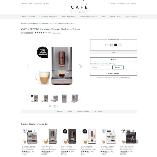
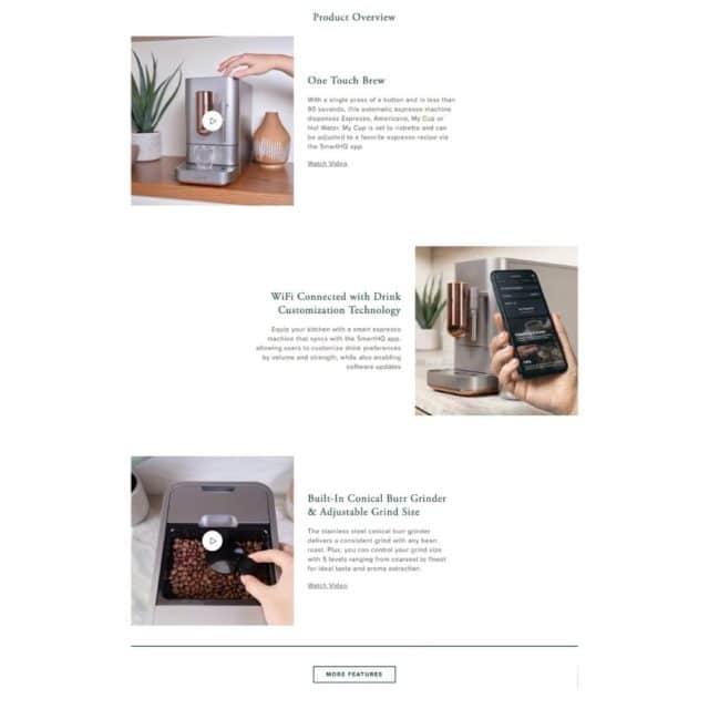
Cafe Product Page
Create Search Results Pages and Category Pages That Convert
Before we dive into best practices for search results pages and category pages, let’s talk about what they are.
- Search Results Pages – Search results pages show products that populate when a search is performed on site.
- Category / Collection Pages – A category or collection page includes products that are part of a specific grouping or merchandising campaign, ie: Men’s Sweaters, Dog Gift Guide, Kayak Paddles, or Spooky Season Books.
While the content for these types of pages may be different, there is a lot of overlap on what to included to deliver the ultimate shopper experience.
-
Filters
In the ecommerce world, filters have many names: category filters, facets, product filters. Whatever you call them, you need them.
Filters do just that – they filter out stuff the shopper doesn’t want to see. Once a customer lands on a search results page or collection / category page, give them the option to select specific criteria and narrow down the selection for relevancy.
Sports and outdoors brand, Altitude Sports does a great job of including filters that they know their customers care about. For example, in addition to filters you’d expect to see such as “Men”, “Women” and “Size”, they also include “Gear”, “Activity”, “Eco Friendly”, and “Volume”.
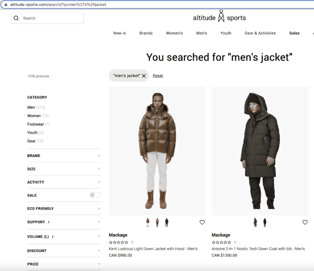
Filters on Altitude Sport’s Website Tailored to Their Customers Needs
A visit to Altitude Sports men’s jackets collection page reveals similar filters but, since they already know we’re specifying “men’s”, it breaks out the type of jacket immediately.
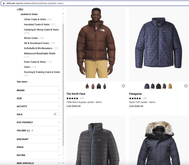
Detailed Filters on Altitude Sports Men’s Jackets Category Page
-
Boosted Products
Take advantage of all Merchandising solutions features. One of these features is the ability to arrange products on search results and category pages however you want. Give best sellers, exclusive items, and products included in gift guides or holiday collections a boost so they are the first thing a shopper sees. Throw on a badge so customers know they’re special.
Boutique clothing store, LimeLush takes advantage of boost rules to highlight new arrivals, best sellers, and exclusives. In this example, a search for “Fall Dresses” shows new and exclusive items on the top row. Doing this further enhances a great shopper experience by displaying relevant products the customer will be most interested in.
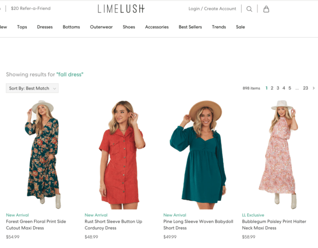
Lime Lush Displays Relevant Products Through Boost Rules on Search Results Pages
-
Inline Banners
Inline banners are your chance to advertise and highlight specific products, campaigns, and collections throughout your online store. You can even promote events or other things going on within your company or industry. With flexible tools, you control everything, so the possibilities are endless.
Mast General Store goes above and beyond with their use of inline banners. They use them throughout their search results pages grid as a way to create an esthetic. By utilizing inline banners to the fullest, they promote events, sales, and seasonal items in one easy swoop.
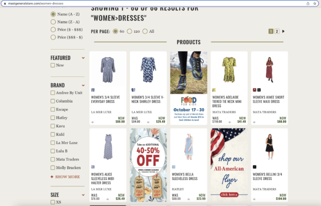
Mast General Store Inline Banners
-
Landing Pages
Build landing pages to correspond with merchandising campaigns and collections. However, you can use landing pages in many different ways.
Pair of Thieves builds beautiful landing pages that highlight collections and campaigns. For their Pride campaign, they display products that celebrate the LQBTQI community and provide messaging about company initiatives in relation to this campaign and explain why it is important to them.
You can read more about Pair of Thieves in their Searchspring Customer Success Story.
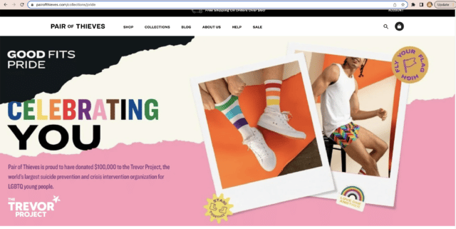
Landing Page Featuring Pair of Thieves Pride Campaign
Most native ecommerce platforms may not provide many of these options, but ecommerce merchandising tools, like Searchspring, give you flexibly and control over your site.
How to Make Checkout the Place Shoppers Actually Checkout
By the time a shopper reaches checkout on an ecommerce store, you might think a conversion is guaranteed. This is it. They’ve come this far. What would make them abandon their cart now?
Plenty. Checkout is the most high-risk stage to lose a purchase-ready customer. Why? Extra shipping costs, being forced to create an account, delivery timeline, trust, and a complicated checkout process are all culprits.
While not all cart abandonment can be avoided, there are steps you can take to streamline the checkout experience.
-
Allow Autofill
Make ease of checkout as easy as possible with optional autofill on forms. Filling out information manually is time-consuming. If there’s an option to make it easier and quicker, do it.
-
Keep Costs and Fees Transparent
Don’t surprise a shopper at checkout with the unexpected. Be upfront about shipping costs throughout your website to increase conversions.
-
Provide an Easy Path to Customer Support
Keep chatbots and social links available at checkout so if the shopper has any questions, they can easily find them. They should also be able to quickly navigate to the “Contact Us” and “FAQ” sections of your site.
-
Less is More
We said it earlier and we’ll say it again: Less is more. The less information a shopper needs to provide at checkout, the quicker the process. Do you really need to know why they’re buying a shovel? Nope. Save unnecessary questions for a survey later on. Not only that, but asking for too much info can seem fishy and the shopper may lose trust in your store.
-
Show Progress
Let the shopper know where they are in the checkout process. A simple design with a bar showing progress makes the process less daunting.
-
Provide Payment Options
From “buy now, pay later”, “pay in multiple payments”, PayPal, credit cards, and checking accounts, there are lots of choices out there for shoppers. Consider all of these to streamline checkout and allow autofill.
-
Provide Recommendations
Similar to little add-on’s available while shoppers wait to checkout in person, provide product recommendations at checkout. These should be relevant to product already in their cart. Make sure not to overwhelm, however. They could end up shopping all over again.
-
Make Create an Account / Become a Loyalty Member Optional
Checkout is a great place to gain loyalty members, but should be optional. Shoppers don’t want to be hassled to do something they don’t want to do, and you can always hit them up again to join post-purchase.
Email Communication
After a purchase, each shopper should be automatically added to your email list. Use it to your advantage.
Below are some best practices for when you should email each and every customer (unless they’ve opted out):
- Post-purchase
- Cart abandonment reminder
- Upcoming sales
- Recommended products (“Picked Just for You”); Just dropped; On sale
- Loyalty points information
To get a more personalized email experience, incorporate Personalized Email Recommendations to make the process easier for your team. Personalized email recommendations take historical shopper behavior data and crafts emails especially for them.
Omnichannel
Now that we’ve talked through ecommerce site design, let’s talk about how to get people talking about your site. While the heaviest importance is on a great site with great SEO, it simply isn’t enough to be competitive. There’s plenty to do that incorporates in-person and digital, but we’ll focus on the digital aspect of omnichannel ecommerce operations.
Jenna Galardi pulled out some shocking statistics for us in our Black Friday Checklist webinar,
“Merchants who adopt just one omnichannel grow 38% in revenue on average their first year. Now, if they’re adopting two or more, their revenue increases 120%. If that’s not enough for you to look into omnichannel strategy is”
– Jenna Galardi, Senior Omnichannel Growth Manager, BigCommerce
Let’s take a look at some omnichannel options for ecommerce sites.
-
Utilize Marketplaces
From Google to Amazon to Instagram, there are several options to get in front of shoppers looking for products just like the ones you’re selling. Make sure the experience on these third-party sites is just as streamlined as it is on your site.
Know How to Optimize for Each Platform – Image requirements, character limits and options, and how the products are displayed are different across marketplace sites. Don’t simply send blanket data to every channel. Doing so means you’re not optimized for performance.
“If you’re looking on Google Shopping, and you know, we all know it needs a white background, but if you’re pushing that product to Instagram, you might want to lifestyle background to fit more within your fee, depending where you’re serving ads. So it’s really critical that you’re thinking about that data.”
– Jenna Galardi, Senior Omnichannel Growth Manager, BigCommerce
It’s also important to test the shopping and checkout process on marketplace platforms. Does Instagram lead to a checkout page that doesn’t allow autofill? If that’s not ideal for your brand, make sure to change it so shoppers have the best experience possible.
BHFO on Google Marketplace
-
Influencers
The use of influencers can have a big impact on your omnichannel strategy. Identify influencers who understand your company mission and deliver messaging in line with your values. Also make sure their audience reflects your target audience.
When using influencers, send them relevant products and images to use in placements and specialized links to track performance. Think about where to send each lead from an influencer and build collections, campaigns, and landing pages for them.
Coffee brand, Peet’s Coffee has an extensive influencer campaign strategy. They find content creators who fulfill the values of their brand.
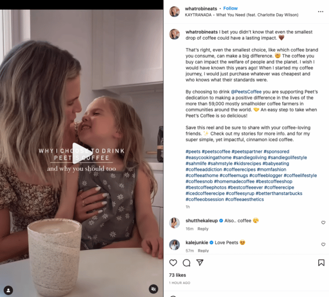
Peet’s Coffee Leverages Influencers to Spread Their Messaging
Prepping for a Sale or Event
Another aspect of a great ecommerce experience is knowing how to prepare for a sale or event.
-
Timing
During the Black Friday Checklist webinar, we asked what stage of planning the audience was in for Black Friday / Cyber Monday. It was reveled that 25% of participants have not yet started their planning. With only six weeks to go, this was a little bit of a concern to our panelists, but noted that if they got started right away, there is still a chance to pull something out.
For a promotion to be most effective, it’s best to start planning at least 45 days out. At this point, start looking at inventory and plan your campaign.
-
Understand Audience Types and Shopper Behavior
There are different reasons different shoppers visit your site. Keval Baxi from Codal mentioned on the webinar that he categorizes shoppers into three basic categories:
- Promo Shoppers – Visiting your site and buying based on coupon code or promotion you’re running.
- Loyal Customers – On your site and buyings because of the product and quality you offer (price may not be a concern).
- Speed Shoppers – Last minute buyers looking for fast delivery and quick buying options.
Keval recommends runnings tests to identify these types of shoppers as soon as possible.
“Through ads or referral URLs for the categories of where they land or what parts of the PDP they look at, what they’re searching. We can get all of those kind of reports and lay it out, and then make optimizations on that behavior.”
– Keval Baxi, CEO, Codal
-
Shop Your Own Site
Place yourself in the customer’s shoes and shop your own site. Preview category pages and complete a purchase from start to finish. This is also an important part of a site audit.
-
Check-In With Vendors
Check-in with vendors to confirm they are prepared to handle a spike in traffic. Ask about what they have planned (and what they have tested) if an issue occurs. As an added safety net, create a contingency plan for a system outage. Plan for an increase in customer support queries and have communications ready to send in the event of a site crash or payment failure.
-
Check-in With Internal Teams
Yes, your marketing and ecommerce teams are already familiar with the details of your promotion, but make sure all departments are up to speed. Create briefs and communicate with teams you lean on most during the busy times.
-
Review Information Pages
Make sure FAQ pages are up-to-date and adjust their content as needed. If you anticipate delivery delays, make sure this is clear. Be transparent and keep shoppers informed to eliminate frustration or confusion.
Reporting
To really understand your audience and what works and what doesn’t, you need to dive into Insights and Reporting.
Below are some reports to get you started:
-
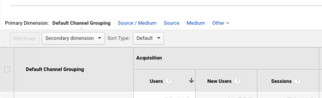
Medium
Find out where your shoppers are coming from. Google? Social media? Somewhere you didn’t even think of? Figure it out so you can optimize all channels appropriately.
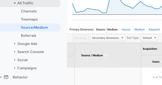
Google Analytics Source / Medium Traffic
-
Popular Searches and Keywords
Look at what shoppers searched for in previous years or during similar sales. Do shoppers repeatedly search for a product you don’t carry? Consider stocking it now. Do customers look for “pants” and struggle to find “jeans”? Make sure synonyms are set up. Curate a dedicated landing pages to your campaign and examine search query data to identify trends.
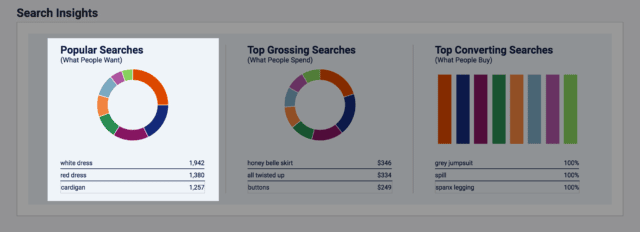
Searchspring Popular Searches Report
In addition to popular searches on your site, analyze Google Analytics keywords. What is trending? What keywords are your competitors using? Leverage this information to help SEO and determine needs. To do keyword research, use tools such as SEMRush, Moz, or Ahrefs. If SEO tools aren’t in your immediate future, simply start searching Google with products you carry and find what pops. Look at how sites on the first page of Google describe their product and optimize your site accordingly.
Please note that this does not mean using the same language. Stay true to your brand voice and keep it original.
SEM Rush Keyword Tool
-
Zero Search Results
Services like Searchspring can help make sure shoppers don’t encounter zero-results on their searches. Pull insights on zero-results and set up synonyms or redirects as needed. Also check misspellings and use “did you mean” suggestions through autocorrect. Get creative with your zero-results page and optimize so shoppers don’t bounce.
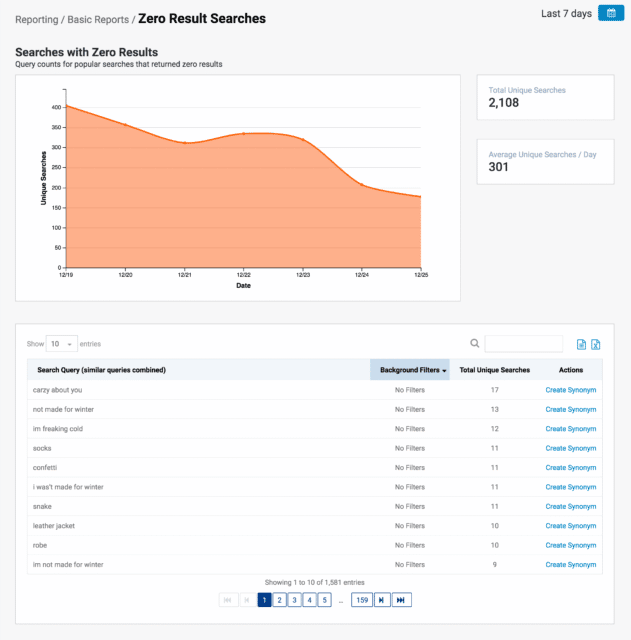
Searchspring Zero Results Report
-
Category Insights
Learn about what categories shoppers interact with the most. Look at bounce rates, time on page, page views, interactions, and page value. Find quick wins to boost under-performing products, and double down on landing pages, messaging, and promotions that convert. Find opportunities to adapt your merchandising strategy for a more engaging product display. Try boosting best sellers, top rated products, or your biggest discounts to capture shoppers’ interest.
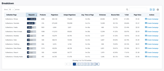
Searchspring Category Insights Report
-
New vs. Returning Visitors
Focus on ways to turn seasonal shoppers into repeat customers if you want to extract maximum value from visitors who are shopping because of a sale or promotion. For loyal shoppers who return again and again, consider an extra special incentive to reward them.
Google Analytics New Users
-
Conversions & AOV
How does your sales Average Order Value (AOV) compare with other times? If it’s lower, upsell and cross-sell more during sales events. Use product recommendations to surface personalized suggestions to shoppers.
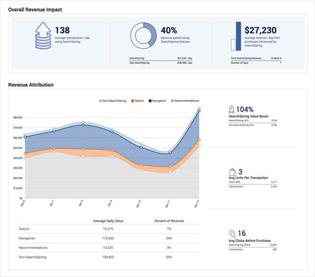
Searchspring Revenue Reporting
Run a Site Audit
To really prepare for a sale or event (or just anytime, really), it’s important to run a site audit to make sure your ecommerce site is performing at its peak. A site audit will reveal gaps in the user experience and pinpoint necessary improvements. Some other benefits include:
- Provide a better user experience
- Streamline the path to purchase
- Increase conversion rates
- Produce happier customers
Below are some things to consider when you perform a site audit on your ecommerce site:
-
Site Search
Review search reports for common queries. Are they accurate? Can shoppers find what they’re looking for? Does the no results found page lead to a dead end? Shoppers who search are more likely to convert so this part of the shopper experience is crucial.
-
Merchandising
Click through category pages and assess that the right products are on display. Are boost rules being taken advantage of? Banners? Badges? Geo-targeting? Check out this merchandising strategy guide for more.
-
Recommendations
Intelligent product recommendations drive up average order value if they’re used effectively. Review products suggested to shoppers at each step of the journey. Also take advantage of cross-selling and upselling relevant items versus displaying unrelated products at random.
-
SEO
Realistically, a site’s performance on search engines deserves an audit of its own. From reviewing current rankings and identifying keyword gaps, to fixing issues with technical SEO. Give plenty of time for this step.
-
Site Speed
Page load times affect everything from user experience to SEO. This step is easy to check thanks to free online tools, but fixing issues takes time. Run speed tests regularly to stay on top of technical problems that can slow down your site.
-
Broken Links
As with site speed, broken links are a big no-no from both a shopper and search engine perspective. They are also common in ecommerce because of discontinued products or restructured categories. Luckily, it’s very easy to find any broken links that have cropped up since the last audit using online tools and Google Analytics.
-
Mobile
Don’t confine an ecommerce site audit to desktop. Many retailers treat the mobile experience as a set-and-forget aspect of a site redesign or upgrade. However, as stores evolve or as new lines are added, check for unexpected impacts on the mobile version of the store.
Learn more about ecommerce site audits in Searchspring’s Auditing Your Ecommerce Site’s webinar.
Ecommerce Tips to Take You Into Black Friday / Cyber Monday and Beyond
We covered quite a bit of best practices in this article, but keep in mind that this is just the beginning. To really get the most out of your ecommerce site, it’s important to utilize tools that will optimize your native ecommerce platform and give you complete control. Get ahead of the competition and reach out to Searchspring for more ecommerce best practice tips.
Watch the entire Black Friday / Cyber Monday Checklist webinar below and sign up for more webinars from Searchspring to stay on top of current trends and optimization techniques from ecommerce industry experts.


