For years, we’ve watched even major online retailers struggle with some of the basics when it comes to ecommerce merchandising best practices. Which, for us, begged the question…
What resources are out there?
We couldn’t find anything… and we hunted for information.
With so much trouble finding anything ourselves, we figured everyone else was having the same problem.
So, we decided to get our hands dirty and find out what the best of the best are doing.
We’ve consulted with every expert we could in various fields to build the most comprehensive ecommerce merchandising guide possible.
This is the result of those labors.
(And we’re not done, this is a living, breathing document for us. Bookmark it! Signup for notifications. We’ll be adding ecommerce merchandising best practices to this guide on a regular and irregular basis with new tips as we come across them)
Ready to start merchandising?
To start, let’s clarify what we’re talking about when we say “ecommerce merchandising.”
Chapter 1
What are ecommerce merchandising best practices all about?
Presentation
As in, how products are presented and arranged on any given results page.
Merchandising tactics can be applied to everything from your homepage to your search results and category pages. Ultimately, ecommerce merchandising best practices are all about getting the right product in front of the right shopper at the right time.
Chapter 2
Controlling how your products are grouped
In a brick-and-mortar store, much of a retailer’s merchandising strategy is driven by how products are grouped, categorized, and displayed together. Ecommerce merchandising best practices are no different.
Chapter 2.A
Grouping related products
Imagine you’re out browsing at your local mall for that killer new two-piece for next weekend’s pool party. How i’s the merchandise displayed? Are all the tops on one rack and all the bottom’s on another rack across the store?
Of course not, that’d be silly.
For merchants following ecommerce merchandising best practices, it makes sense to group products the same way online.
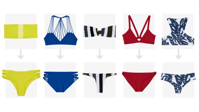
Swimwear retailer Mikoh does this. They group matching products into pairs similar to the way they’d be hung on a rack at a store.
Chapter 2.B
Grouping similar products
Grouping isn’t limited to ensembles or matching product sets.
PinkLily groups products in the same category based on their color. Again, this is very similar to the way the retailers merchandise their items in physical stores.
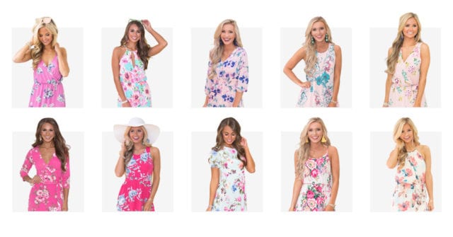
For those that aren’t sure of exactly what they want to buy yet, this style of presentation can help to introduce them to the variety of options available within that category.
Let’s call this one the “mall browser’s merchandising strategy”
Chapter 2.C
Grouping brands
In brick-and-mortar retail, it’s very common to place items from the same brand next to each other on the shelf, or on the same rack.
Often, this practice translates well to the online store as well.
Imagine shopping for an “Apple Extended Keyboard.”
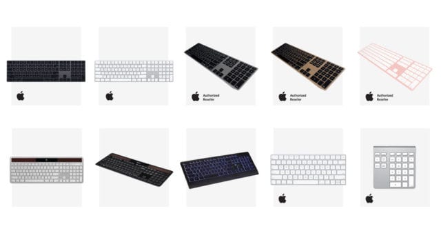
Now, we all know Apple doesn’t play nice with 3rd party hardware (most of the time). So, even though there are a plethora of 3rd party options, promoting and grouping original Apple products together might be advantageous and incredibly helpful for shoppers.
At the very least, anytime 3rd party vs. OEM is at play, grouping branded products together is a smart play.
Chapter 2.D
Separating products from accessories
When a user searches for a high ticket item, the last thing you want to do is display a page full of accessories.
When a shopper searches or browses for a “Nintendo Switch” they expect to see a Nintendo Switch, not adapters, cables, controllers, and whatnots.
Promote the products that match the shopper’s intent. Move the accessories down.
9 times out of 10 when a user wants an accessory item, the search or browsing behavior will be more specific.
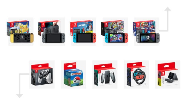
How to sniff out which products to merchandise this way:
Granted, that won’t always be the case, so if you’re unsure on a set of products, take a peek at your Google Analytics. Here’s what to look for:
Go to the “Search Terms” report under Behavior
Look at these data points:
Search exits: A significantly higher than average exit rate would likely indicate that the results visitors are seeing are not satisfactory.
Search refinements: This tells us how many times people who searched for “Nintendo Switch” tried another variation. Any time this number is greater than 0, it means they didn’t find what they wanted the first time.
Time after search: This tells us how much additional time the visitor spent on your site after completing this search. Higher numbers are generally better.
Average search depth: This tells us how many additional pages were viewed after completing the initial search.
If this number is between 1 and 2, it could mean that the visitor clicked on a product, and then went on to other areas of the site. If it’s higher than that, this probably means that they didn’t find what they wanted and went on to try other search queries.
Chapter 3
Controlling how products are promoted and boosted
Depending on your business objectives, there will always be certain products that should take precedence on your category pages and search results. There is no one-size-fits-all approach to ecommerce merchandising best practices – they should always be adjusted and adapted based on your business goals.
Boosting rules and pinned product give you this control over product display, without the manual heavy lifting. Maybe you want to set a site-wide rule that your house brand should always appear first? Global boost rules can dynamically make this happen. Perhaps you have one or two categories where you want to take a different approach; no problem, your category boost rules can be set to override your site-wide strategy. Trying to offload the last of this season’s inventory? Pin those products to the top of a page and let your boost rules take care of the rest of the page.
With the right merchandising tool, you can dynamically boost and promote products with flexibility and control. Read on for the different boosting strategies to take based on your business goals.
Chapter 3.A
What products to boost
Boosting on-sale products
Have a flash sale coming up, or maybe trying to clear out some stagnant inventory with discounted prices? If you’re following ecommerce merchandising best practices, you’ll want to get those products top, front and center. Boost “on sale” items to the top of your results pages.
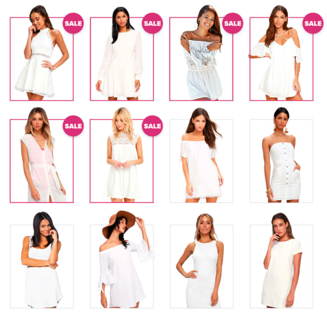
Bonus: pre-set the display order with date triggers so any product on sale only moves to the top of the results display while it’s on sale and reverts to its original product display order when it’s not.
Boosting high-converting products
As simple as the title says.
Imagine searching for “dress” and all the best performers (not most clicked, but most purchased) displayed in the first few positions.
Make this strategy global or only for a select few product categories. Either way, it’s a great way to engage your first-time shoppers with your tried and true best product offerings.
Boosting high margin products
Yes, you should always focus on what the shopper wants, but why should that come at your expense?
You can get yours too!
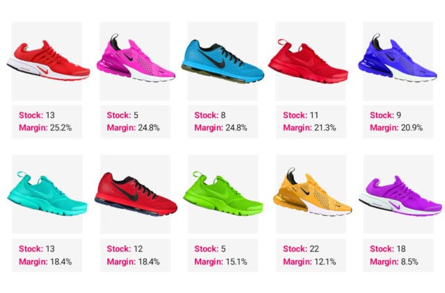
Boost products that have higher margins, while retaining the overall relevance of products on a particular search or category page.
Boosting trending products
How vulnerable are trends?
If you’re at the mercy of a temperamental customer base, promoting products based on popularity could be your ticket to relief-ville.
Rather than manually arranging products on a day-to-day basis, try setting an automated rule that promotes products that have been popular over the last few hours to days.
Chapter 3.B
How to boost products based on shopper behavior
Ecommerce merchandising best practices surrounding boost rules will vary depending on your customer base. Here are some top merchandising tips to consider based on shopper behavior.
Rotate products for repeat visitors
Get a lot of repeat visitors?
The odds are good that your regular shoppers are hoping to see something new and fresh.
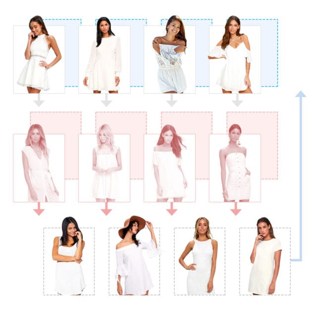
Rotating products is a good way to ensure that your most valuable shoppers see something different the next time they visit your store – even when your product catalog hasn’t flipped with new inventory yet.
Boost popular products for new visitors
Get a large number of new shoppers each month?
Promote products that have received high review scores to the top of your most popular result pages.
Boosting products based on demographic
Many retailers cater to many demographics but receive an overwhelming amount of traffic from one in particular.
As one example, novelty shops often find that despite carrying costumes for male and female characters, the overwhelming majority of the sales are for female costumes.
Even a search for “Spiderman” (which by default is a male product) often results in purchases of female versions.
In this case, a rule could be created that would promote female products above male ones.
Chapter 3.C
What products to demote or hide
Don’t forget, boost rules work both ways. As well as promoting the products you want shoppers to see, ecommerce merchandising best practices include hiding or demoting the items you want to keep out of sight.
Demoting out-of-stock items
* click *
“out of stock”
* click *
* on backorder *
You know your shoppers are cursing you from the other side of the screen, right?
Not anymore! Demote out of stock items to the bottom of the results page.
Bonus: Use this strategy with any sales and promotions that you’re running. Imagine the shopper hate you’ll avoid by no longer displaying that product that JUST went out of stock at the top of the results.
Demoting products with limited sizing availability
Speaking of shopper frustration, is there anything more annoying than finding the perfect pair of jeans only to discover your size isn’t available?
Set a rule here that makes sense for your shoppers. For example, if you know that most of your customers opt for medium sizing, demote any products that only have XXXS in stock.
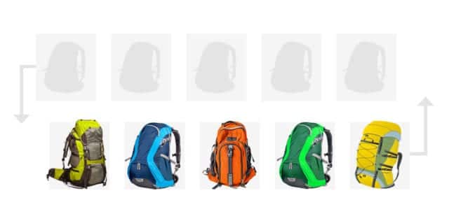
Demoting products with missing images
A stupidly simple ecommerce merchandising best practice.
But, shockingly under-used.
Outside of making shopping easier, demoting items that are missing product images to the bottom of results pages can pay dividends.
Chapter 4
Badges and banner campaigns
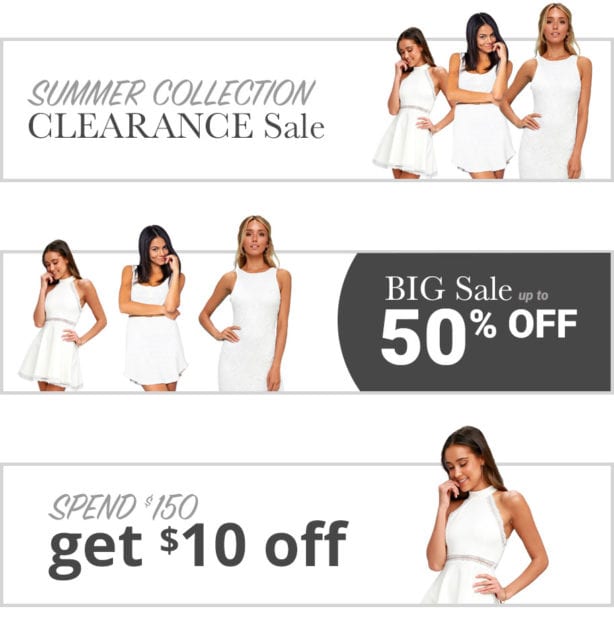
Display customizable banners on search result pages, brand pages, or category pages to promote special deals or incentives.
Seasonal and geographic merchandising
Use unique banners with each new season to promote recently added items or discounts on last year’s inventory.
Even better, use geographic merchandising to display products and messaging that reflect the shopper’s local climate. Perhaps your Californian shoppers are buying up summer tees while they’re still stocking up on hats and gloves in Illinois. Or, maybe you have shoppers experiencing entirely different seasons in different hemispheres. Add that personalized touch by making sure the most relevant banners are always on display based on location.
Feature banners beyond the landing page
Another favorite ecommerce merchandising best practice is to include banners atop search result pages or category pages. This can help promote hot ticket items and generate excitement for promotional offerings across your entire storefront in all relevant situations.
Two of the most popular promotions you could implement would be free shipping” and/or “BOGO (buy one get one) offers”.
Don’t forget inline banners
All is not lost if a shopper scrolls straight past that banner you’ve placed at the top of a category page. Inline banners allow you to grab their attention as they browse, highlighting special offers, sales, or buying guide content right in the product grid.
Incentivize higher AOV
For some reason, this one tends to be overlooked, but it’s a powerful promotion that can consistently increase your AOV.
Use banners to encourage shoppers to spend more than they were originally planning by offering an incentive, like free shipping or a free gift if they spend a certain amount.
In addition to increasing the immediate AOV, it also drives shoppers back to the store to redeem the gift card.
Spotlight products with badges
Add merchandising badges to your product listing pages to highlight items that are trending, selling fast, back in stock, on sale, and more. These visual badges are the online equivalent to an eye-catching sale sticker in store. Grab shoppers’ attention and create a sense of urgency around their purchase.
Just make sure that…
To follow these ecommerce merchandising best practices effectively, make sure you’re using consistent ad copy and promotional codes across the board – social ads, landing pages, emails, etc…
Chapter 5
Landing pages
Running a flash sale? Need to curate a collection of products in a new way (without involving your dev team)? Want to send marketing campaign traffic to a specific set of results?
Merchandising landing pages let you do all of the above, and then some. These are the ecommerce merchandising best practices to consider when setting them up.
Setting up your landing pages
A landing page is usually a completely custom set of products, created from scratch, with the aim of creating a link you can use in your email campaigns, social media posts, or even on other pages on your website.
With the right merchandising solution, you can set up landing pages in a matter of clicks. Add a banner, give it a name, drag and drop or import your chosen products, and determine the order in which they should display. Boom, you have yourself a fresh take on existing inventory that’s ready to share.
When to use merchandised landing pages
Landing pages are a great option for grouping products together for a certain period of time, or for a particular purpose.
Think holiday gift guides that allow shoppers to browse “ideas for him”. A “steal her style” page that pulls together products from your latest influencer campaign. “Shop the trend” collections that group all of your teal colored home accessories (based on your latest Pinterest campaign). Maybe even a search redirect landing page that suggests alternative products when a shopper searches for a brand you don’t carry.
Bonus tip: landing pages can be pre-scheduled to launch and deactivate at dates and times of your choosing. No more forcing your team to push flash sales live at 5am – set your pages up in advance, test them thoroughly, and take the stress out of campaign launch day.
Ready to implement these ecommerce merchandising best practices? Let’s talk.
Online merchandising doesn’t have to be a time-depleting, manual chore. With the right insights, tools, and technology, you can transform your merchandising strategy into a dynamic, conversion-driving thing of beauty.
If you’re ready to start implementing the ecommerce merchandising best practices in this guide, but you’re not sure where to start, drop us a line! Our team of ecommerce experts are the best in the business (if we do say so ourselves). They’ll assess your online store to spot the merchandising opportunities you might be missing, and share their insights on how you can elevate your merchandising game.
