Conversion rate optimization (CRO) in ecommerce is the process of making improvements to your digital storefront (i.e., your website or mobile app) to encourage more online browsers to become buyers.
Okay, now that we’ve established what CRO is, let’s move onto the more pressing question:
Why is CRO important to online retailers?
Some quick arithmetic give us the answer. The average global ecommerce conversion rate is only 2.58%, according to Adobe. That’s a staggering 97.42% of shoppers visiting ecommerce sites who don’t get through the checkout. Take a moment to consider how a mere 1% lift in your conversion rate would affect overall revenue. Let’s say your site attracts 20,000 visitors per week, has a 2% conversion rate, and an average order value of $150.
Moving the conversion needle by just 1% would take your annual revenue from $3.12M to $4.68M—and that’s without attracting any new traffic to the site.
A solid conversion rate optimization (CRO) strategy isn’t about selling products. It’s about creating convenience, demonstrating value, and serving experiences that create authentic connections with shoppers. Why? These key ingredients can not only boost revenue individually but, when combined, can also increase customer loyalty and customer lifetime value (CLV).
Conversion rate optimization is one of the most accessible ways to boost your brand’s bottom line. 50% of retailers surveyed in the Searchspring State of Ecommerce report experienced the most success in the year prior from driving improved conversion.
So, how can you increase your website conversion rate? Everything your brand does to drive genuine connections with shoppers can have an impact on CRO. But first, it’s critical to understand shoppers’ motivations.
Simply put: connection equals conversion
The way that consumers shop is changing—and brands must adapt their conversion rate optimization (CRO) strategy to continue meeting shoppers’ expectations.
McKinsey data from August 2023 shows that in Australia, 63% of consumers surveyed said they had adopted new shopping behaviors in the past three months, including shopping at different stores or buying different brands. This figure is even higher in India (87%), China (83%), and South Korea (67%).

Amidst ongoing supply chain challenges in recent years, consumers prioritized the availability of products and speed of delivery. However, those times are changing. Think with Google recently revealed that 60% of US consumers say a website or app that makes shopping easier is now an important factor, a leap of 10% over the year prior. The search giant’s data also shows that globally, 32% of consumers are doing more research on purchases while shopping.
Consumers’ priorities and their buying journeys are becoming more complex. They’re also making more considered purchases and showing a strong influence by three key decision drivers:
Convenience
The Australian Ecommerce Report from IAB shows that 67% of consumers say convenience is the number one reason for purchasing online. Mirakl data also reveals that 77% of consumers globally believe marketplaces provide the most convenient online shopping platforms.
Key Takeaway: While competing with major players like Amazon on aspects such as delivery speed and returns processes isn’t always practical, consider how to stand out with exceptional experiences that make the online shopping journey engaging and convenient. Read more in this article’s section, Engaging experiences that encourage conversion.
Value
As shoppers think more strategically about their purchase decisions, value becomes increasingly important. According to Mirakl, 86% of US consumers say inflation has made them look for better value when shopping. EY data also shows that globally, 64% of consumers will be more focused on value for money in the future.
Key Takeaway: How can you more effectively communicate value at each point in the customer journey? An effective strategy is enabling other customers to demonstrate that value for you. Explore actionable approaches in The impact of reviews, ratings & UGC.
Connection
Every customer interaction with your brand can strengthen your connection with them—or break it. When shoppers feel connected to your brand, conversion comes naturally. For example, 63% of people buy or advocate for brands based on beliefs and values, according to the Edelman Global Trust Barometer. On the other hand, Salesforce shows that for 74% of consumers, it takes no more than three bad experiences to abandon a brand.
Key Takeaway: Think about the entire shopper experience, from search to delivery and beyond. What strengthens connection at each stage of that journey, and what keeps customers coming back? Examine the post-purchase experience, which we cover in detail in Boosting loyalty and re-conversion after the checkout.
SEO tips to attract and convert the right shoppers
In December 2022, Google updated its quality rater guidelines to the current E-E-A-T format. Experience, expertise, authority and trust are how the tech giant determines the quality of content when ranking it for search engine results pages (SERPs).
Why does your search engine ranking matter? Because every conversion starts with a click. With more clicks through to your site from SERPs, the greater number of shoppers you can potentially convert.
Research from FirstPageSage shows that the average click-through rate (CTR) for first-position organic results on SERPs in 2024 is 39.8%. That’s more than twice the CTR of second-position results, at 18.7%, and nearly 4x higher than third-position results, at 10.2%.
While on-page factors such as the E-E-A-T score of your content are critical to attracting the right shoppers, there are various other factors that impact your SERP ranking—and whether a shopper is likely to click on your link.
Understand keywords and their intent
When creating product descriptions and meta descriptions, take a moment to think about the primary keyword that shoppers may use to find your products. The keyword can be as short as a single word or as long as a phrase. It also reveals a lot about what your customer wants and the buying stage they’re at. For example:
- Informational intent: shoppers are usually browsing and may use phrases like “types of winter coats”.
- Navigational intent: customers want to find something specific on your site, such as “The Oodie returns process”.
- Commercial intent: your shoppers are getting closer to their purchase decision and want more information about specific products, e.g. “warmest full-length winter coat”.
- Transactional intent: it’s time to buy! Your shopper knows what they want and is ready to make a purchase decision, e.g. “spyder men’s volt shell jacket”.
Use keywords effectively in blog content
Keyword research will also help shoppers connect with your products if your brand features a blog. Many online retailers, such as Didriks, feature a blog to inform and inspire shoppers. This informational content can be a powerful way of influencing conversions. One study shows that 68.5% of consumers would consider purchasing a product after seeing it advertised on a blog.
When planning SEO-driven blog content, aim to:
- Choose a primary keyword with a high search volume and low keyword difficulty. SEO applications such as SEMrush, Ubersuggest, and Ahrefs provide detailed keyword information and tools to find new keywords.
- Include your primary keyword in the blog title and meta description.
- Use the primary keyword within the first 1-2 paragraphs of the article.
- Don’t overuse your keyword. The days of “keyword stuffing” are long gone, and your content will likely be penalized rather than promoted.
- Remember Google’s E-E-A-T guidelines—write from a position of experience and expertise to help your articles ascend through the ranks.
Hitting the mark with H1s, titles, and metas
The H1 tags of your content or ecommerce product pages should align with the primary keyword you’re targeting, which in many cases, will relate to the product name. These factors also apply to meta descriptions (the “preview” text seen below the link on SERP listings). Include your primary keyword in meta descriptions and make them enticing for real shoppers to click through on that result.
Additionally, think about aligning product page titles with the most optimized keyword. Consider including the specific product variant or differentiating factor that applies to it.
Example H1: “XYZ Black Leather Handbag”
Example Meta Title: “XYZ Black Leather Handbag – Black XYZ Handbags Online”
Example Meta Description: “Looking to spruce up your look this winter? Shop our latest Black Leather Handbag online from XYZ. If you love trusted brands like XYZ and need a new black leather handbag, shop today with free online shipping!”
Remember that people also refer to the same things differently, so evaluate how to include synonyms, antonyms, phrases, and stories in your copy and meta tags.
Go behind-the-scenes with robust URL structures
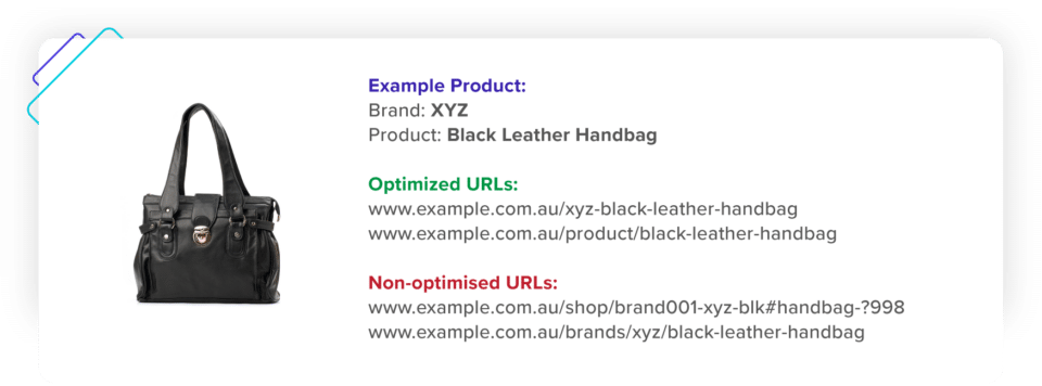
A strong URL structure can further boost your search rankings. When setting up a system or pattern for URLs, think about how shoppers search for your products. Does it read the same way it sounds? Shoppers will often type a product query the same way they would verbally say it. For example, just as a customer might ask a sales assistant in a store for a “long-sleeved shirt with a Cuban collar cut”, you might think about creating a URL of www.example.com/product/cuban-collar-long-sleeve-shirt.
To make URLs more easily readable, keep your URL path neat with the product name separated by hyphens. Additionally, include the product variant if it’s something people search for, such as color, size, or material.
Lastly, try not to use general names or categories in your product URLs, e.g., /black-dress-123 or /mini-dress-brand etc., as these names may compete with categories or similar products for the same search intent.
Driving it home
Aside from these straightforward SEO tips, product pages must also be user-friendly and created with conversion rate optimization in mind for real shoppers.
One last word of advice—steer away from copying the manufacturer’s content unless you absolutely have to. Your content won’t be unique if competing brands use the same manufacturer’s copy. Distinct content helps you stand out and show Google you have more valuable information that serves your shoppers’ intent, helping you move up the rankings.
When implementing any changes to your URL format, H1s, titles, metas, and content, it’s always advisable to take an implement-test-repeat approach. Make one type of update at a time, wait for the changes to take effect (typically at least 3-4 months), measure the results and impact on SEO, and then move on to the next test case.
Armed with these tactics, you can make significant gains to your organic reach to attract and convert the right shoppers.
Practical ways to enhance the online shopping experience
Brick-and-mortar stores have a distinct advantage—tangible experiences. Take a moment to reflect on everything a physical retailer has in their toolkit to engage shoppers. There’s the obvious benefit of being able to touch and feel products first-hand. Shopfronts and merchandising displays paint vivid pictures of how products can enhance shoppers’ lives. Some stores even use sounds and scents to create stronger sensory connections between shoppers and their brand.
Sales reps are another powerful part of the in-store experience, picking up on subtle behavioral clues that indicate a shopper’s intent and responding to them. For example, a customer looking at two similar products presents a strong signal they’re in the “decision” stage and almost ready to purchase.
Stores are also bringing in new technologies, such as interactive digital displays and augmented reality (AR) tools that help shoppers virtually try products and enhance the overall shopping experience.
What picture does your online storefront paint?
How does your ecommerce store’s homepage stack up to a physical shopfront with the same products laid out in the same way? Is your front page designed to build a story that draws shoppers in with visual merchandising? And how are you helping those shoppers discover new and related products they’ll love, for example, “complete the look” or “you might also like” suggestions?
Early Settler paints a vivid picture of how products can enhance shoppers’ homes with high-quality imagery, story-driven elements, and curated collection carousels. The added advantage digital storefronts have here is being able to analyze engagement and change displays at speed—while adapting to the individual shopper’s behaviors.

Image: Early Settler
Now consider the experience beyond the homepage. How are similar or complementary products grouped together throughout your site? Are you offering bundled items to make the add-to-cart process fast and effective for your shoppers? Digital retailers have the ability to serve different products, sizes, colors, and more to shoppers in an instant—something that would be impossible at a physical store. This means online brands can again take the lead in customer experience by using real-time purchase data to create and adjust bundle offers quickly.
Think of your website layout as a way to serve customers strolling through your digital store. Look to guide them through your range with engaging imagery and collections that promote product discovery.
The fine details of CTAs
A HubSpot CTA study proves personalized call-to-actions (CTAs) perform 202% better than basic ones. Simply tailoring your CTA text can prompt shoppers to explore relevant product ranges. Multi-national sportsbrand 2XU makes excellent use of homepage CTAs, such as the “Summer Run in Color” initiative that immediately encourages shoppers to “Shop Women’s Run” products or “Shop Men’s Run” items. These CTAs connect consumers with beautifully presented collection pages that explore these run collections.
Review the use of CTAs throughout your site and look for opportunities to create more relevant prompts for shoppers to explore products.
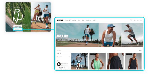
Image: 2XU
Make use of your ecommerce edge
Ecommerce has another distinct edge over physical stores. The ability to personalize results and product displays based on who is wandering through your online store is something the in-store experience can’t match.
Providing shoppers with more relevant search results and reordering items based on their behaviors can have a significant impact on conversion. However, many sites have yet to take advantage of this simple change. Baymard Institute shows that 70% of leading e-commerce sites’ search functionality doesn’t return relevant results for product type synonyms. Shoppers must search using the precise product names and jargon of the seller. 34% of sites also don’t return useful results when shoppers search for a model number or misspell just a single character in a product title. These obstacles create a frustrating experience that can either slow shoppers down—or worse still—see them quickly navigate away.
Think about what’s powering your on-site search. As the leading ecommerce conversion optimization platform, Searchspring knows the impact of our intelligent on-site search solution. We also know from experience that, when done right, smart search functionality streamlines the shopping experience and drives significant conversion uplifts. Examples of measured results include The Oodie, which saw a 156% increase in conversion from search, and 2XU, which experienced a 100% increase in search-attributed revenue.
Enhance back-end data to power better front-end experiences
Well-crafted product descriptions and product metadata contribute to a seamless search experience. Review your product copy to ensure it’s descriptive, contains relevant keywords, and answers shoppers’ queries. Not only will this create a more convenient search experience for customers, but it will also reduce the number of “zero results” pages seen.
When those zero results pages do show up, consider how to turn that dead-end into a product discovery opportunity. Personalized product recommendation carousels are incredibly effective on zero-results pages, offering shoppers alternative products based on their observed on-site behaviors.
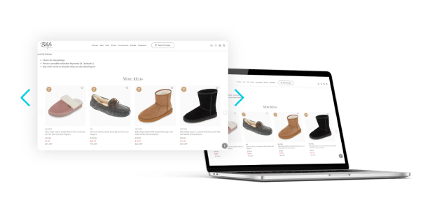
Image: BHFO
Make your ecommerce store the trusted website for online shopping
Daniel Kahneman is a Nobel prize-winning economist, author, and psychologist well-known for his published works on the psychology of judgment and decision-making. Kahneman brought the term “cognitive ease” into the spotlight. This theory has vast implications for retailers in many areas of their buyers’ decision-making processes.
Cognitive ease is a measure of how easy it is for our brains to process information. It takes multiple factors into account, such as familiarity, repetition, clear display, ease of experience, and so on.
In his book, Thinking Fast and Slow, Kahneman explains that people have two ways of thinking: rapidly and automatically and more consciously and critically. The more mental effort required to understand something, the more cognitive ease diminishes. For example, if we see 50% off a pair of shoes that are $100, it’s easy for us to calculate an item’s cost. However, 47% off $102.43 will have us racking our brains for the answer. When the latter occurs, we switch from making a fast decision to thinking critically about the deal’s value, the product benefits, whether we need a new pair of shoes, and so on.
The same psychological principle applies to trust and security signals when shopping online. The visual indicators you provide on-site can put consumers in a state of cognitive ease—or leave them more cautious about their next steps.
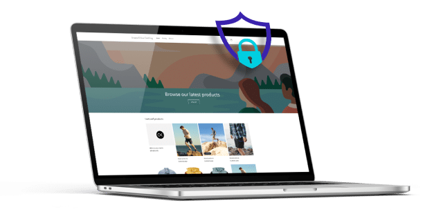
Look at the trust and security signals you provide to make your store the trusted website for online shopping, such as:
- Direct contact information that’s clear and easy to find
- Privacy policies in your website footer
- The use of trust badges
- Familiar, secure payment methods at the checkout
- Shipping costs and details
- Images or maps of store locations (for retailers with a physical presence)
- Average star ratings from providers like Google Reviews, Trustpilot, or REVIEWS.io.
Additionally, consider how to display the above items on your homepage. As the first place many of your customers will land, it’s crucial to help them get into a state of cognitive ease as quickly as possible.
Shoppers also commonly use your site’s search function to look for information that’s not immediately noticeable. Many online retailers create specific pages that answer shoppers’ queries, such as a “how to return items” page, though they sometimes miss the mark with keywords and search terms. Review your zero-results search query data to identify terms your site visitors use to look for this information.
Learn how to set up zero search results queries in GA4 or the automated zero-results tracking for Searchspring customers.
How to use website ratings, reviews, & UGC to boost conversion
Merriam-Webster announced “authentic” as the 2023 word of the year, describing it as “the term for something we’re thinking about, writing about, aspiring to, and judging more than ever”. In a world saturated with picture-perfect social media moments, AI technology, and the growing prevalence of deep fakes, consumers crave authenticity more than ever.
Brands can convey that authenticity and increase conversion by letting real customers share their experiences. User-generated content (UGC), including unsponsored reviews, ratings, images, videos, and social content, is pivotal to this strategy—and data highlights its impact. Statista research shows that when site visitors encounter on-site UGC, their likelihood of conversion increases by an average of 3.8%. Additionally, shoppers who interact with that UGC demonstrate a 102.4% conversion increase. Let’s take a quick look at the reasons behind how UGC can boost conversion.
People are social creatures, predisposed to incorporate social signals when making complex, value-based decisions. This notion is especially true when making purchase decisions and forming value perceptions of products. For example, a study published by the Society for Neuroscience asked people to provide their value judgments of consumer products on the Amazon marketplace. Researchers showed participants a series of products and asked them to give their liking and confidence ratings.
Researchers then showed the same products again, this time including reviews from other customers who had purchased the item, using genuine reviews from the Amazon website. The review data was presented as it appears on the Amazon website, including the average customer review rating (1–5 stars), the total number of reviewers, and a 5-bar histogram showing the distribution of ratings across reviewers.
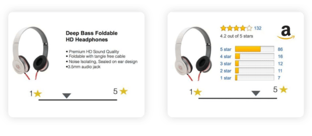
Image: Early Settler
The results of this study showed an overwhelming trend. Participants actually increased their product liking and confidence ratings after seeing positive reviews of those items from other customers. In other words, other shoppers’ ratings heavily influenced the participants’ value perceptions of those items. Ratings also increase the likelihood of purchase—with one study finding that shoppers were 270% more likely to buy a product with five or more ratings vs. those with zero.
By using customer reviews and ratings, brands can quickly build shoppers’ confidence in products and influence their purchase decisions. In fact, Gartner shows that 85% of shoppers trust online reviews as much as a personal recommendation.
Reviews and ratings aren’t limited to being displayed on-site. Merchants running Google Ads can also leverage Google Seller Ratings, which displays your store’s average rating. Google maintains that it uses a complex algorithm that considers factors such as your store’s overall quality, reliability, and performance. It requires at least 100 unique reviews from the past 12 months and an average rating of 3.5 stars or higher.
Social media also provides a powerful platform to get your UGC seen by the masses. Brands have a growing opportunity to build communities by encouraging and engaging with real customers’ unsponsored posts that include pictures, videos, experiences, and reviews of products across various social platforms. Keep a close eye on brand and product mentions and actively contribute to the conversations to further build brand advocacy and social proof.
Lastly, look for opportunities to promote and republish reviews, ratings, and UGC. Are you currently showcasing user-generated social content on your homepage? What about product reviews on your product landing pages? Could you include product or brand reviews in your abandoned-cart email flows or new sign-up welcome emails? Look for ways to use UGC across a range of shopper touchpoints to create authentic connections and increase conversion.
Email and SMS tactics to drive conversion (before and after checkout)
Yotpo data shows that Australian consumers’ top three most useful channels to receive information from brands are email (79%), SMS (54%), and social media (51%). These figures are unsurprising, considering ecommerce email and SMS in particular stand out from other marketing channels. Why?
For one, email and SMS are permission-based, so it’s already known that customers want to hear from you on those channels. Secondly, being a one-to-one communication channel, rather than one-to-many, brands can personalize their messaging on these channels. Lastly, there is already a level of trust with these channels because they are where customers receive important, non-marketing messages, such as order confirmations and shipping updates.
Despite consumers’ preference for email and SMS, brands must still think strategically, and from a customer perspective, about optimizing these channels for conversion. Here are four tactics to drive conversions (and reconversions) through these marketing mediums.

Image: Early Settler
Right place, right time
When engaging customers strategically, place and time can mean the difference between hit and miss. However, brands running campaigns across SMS and email have the benefit of comparing engagement and understanding when and where to reach shoppers most effectively.
Review your analytics, email, and SMS data to identify engagement patterns. For example, do email campaigns sent at 10am on weekends see open and click-through rates compared to those sent at 2pm on weekdays? Do shoppers spend more time on-site after clicking through SMS campaigns on specific days or times? Which channel drives the highest conversion for you, and at what time? Consider setting up the right test cases to deliver these valuable buying behavior insights.
Engage customers strategically
Whether you’re already using email, SMS, or both, reaching out to customers during high-intent moments is critical to boosting conversion. This process is made much easier by setting up automated flows triggered by customer actions such as browse abandonment or cart abandonment. Consider how you can incentivize customers based on non-converting behaviors. For example, discounting items left in the cart can be a powerful motivator—but remember, it’s not always about price. Reminders about cut-off times for rapid delivery, highlighting stock availability, or offering personalized product recommendations can also incentivize shoppers to jump back on-site and complete their orders.
Also, consider testing additional flows to encourage post-purchase actions, such as loyalty program sign-ups, subscription offers, and other reconversion activities. By engaging shoppers at high-intent moments, your brand can respond to and influence actions that can significantly impact revenue.
Make conversion an attractive offer
Statista estimates that globally, businesses and consumers will send a mind-boggling 361.6 billion emails each day in 2024. While that may sound like a tall task to break through the noise, every retailer has the opportunity to set themselves apart.
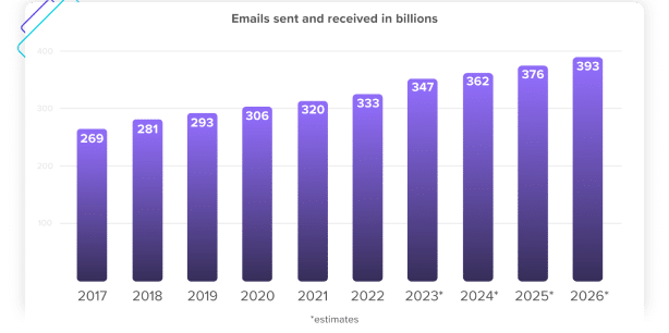
Number of sent and received e-mails per day worldwide from 2017 to 2026
https://www.statista.com/statistics/456500/daily-number-of-e-mails-worldwide/
Think about using clean, distraction-free design and imagery that helps shoppers immediately understand your brand, products, and offers. Are you including images in SMS campaigns to stand out? Are your email and SMS call-to-actions (CTAs) strong enough to entice clicks?
Also, consider what happens after the click. Help shoppers complete their desired actions faster by including CTAs or links that navigate back to their carts, relevant product landing pages, or collection pages.
Make conversion too compelling to resist
Email and SMS may be consumers’ preferred channels to receive communications from brands, but how they engage with your messages can significantly impact conversion and, consequently, revenue. Aim to reach shoppers at the right place and time, at high-intent moments, and make the thought of conversion too attractive to resist.
Ecommerce for mobile: optimizing for experience and conversion
As of January 2024, 58% of all internet traffic globally takes place on mobile devices, according to StatCounter. The rise in mobile usage over just the last decade is staggering. In January 2014, mobile traffic reached just 22%.
To connect with (and convert) shoppers, your brand also needs to be in front of shoppers when they are online and on mobile devices. Did you know the global average time spent on smartphones each day is over 5 hours, as shown by We Are Social?
These figures represent an incredible opportunity for retailers with the right ecommerce for mobile strategy.

Mobile speed
The need for speed is real. BigCommerce reports that 79% of Australian shoppers are likely or very likely to leave a website and purchase elsewhere if a website is too slow. 74% of mobile users in the US will also leave a mobile site if it doesn’t load within five seconds, as reported by WebsiteBuilderExpert.
Want to serve mobile customers faster? Start by testing and benchmarking your mobile site speed. Google PageSpeed Insights provides a quick way to check this data. Implement one change at a time, test, measure, and record the improvements to understand what has made the most significant impact.
Review how your site handles aspects such as:
Image optimization to reduce the file size and load time of all images
Limiting redirects to reduce the number of times a shopper is passed from one URL to another
Minifying CSS and JavaScript files to remove unnecessary code that can slow things down
Understanding whether a shared hosting solution (which is impacted by other websites’ traffic on the same server) or a dedicated server configuration is suitable for your store
Using a content delivery network (CDN) to reduce the distance between a shopper’s location and the physical server that’s delivering your website’s information
Additionally, be sure to conduct performance and load testing. It’s critical to know how your infrastructure will handle an influx of traffic during sales and peak periods and address any shortfalls.
Think thumb-friendly
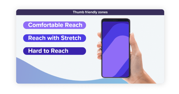
Thumb-friendly zones on your mobile layout can help shoppers reach all the important website aspects with their thumb when using their phone one-handed. Think about how shoppers naturally grip their smartphones and whether the elements on your site are easy to reach. For example, high-value interactions such as add-to-cart and checkout buttons should be easily accessible to all customers.
Use responsive design
Years ago, brands worked with sites built separately for desktop and mobile. Now, most ecommerce sites employ responsive design, which Google says is its “recommended design pattern”. This means that your site has a better chance of organically ranking higher when responsive design is employed. Responsive design means your site responds to the environment in which shoppers view it. For example, your search results pages, product landing pages, and so on all look consistent and easily viewable on desktop, tablet, or mobile.
With such a framework, time-consuming redirects to mobile or desktop sites aren’t required and can speed up the viewing experience for shoppers. If your site isn’t using this design practice, it may be time to revisit.
Keep it concise
Aje Athletica makes clever use of small screens. The product search bar is front-and-center, followed by beautiful full-screen imagery and a guiding CTA, “Shop New Arrivals”.
The search bar returns results as the shopper types their query—but keeps those results restrained with just two visual selections and a “See all results” CTA. This approach helps shoppers quickly find what they need without overloading the limited screen space with too much information.
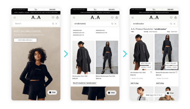
Image: Aje Athletica
Offer fantastic faceted search
Keep your faceted search function (the ability to refine search results with filters) available on mobile without it getting in the way. A collapsible filter menu, as Australian fashion brand St Frock uses, streamlines the product discovery journey.
Shoppers can quickly refine their search results by available size, color, style, occasion, and more. These helpful filter options also make use of extended vertical space, helping shoppers easily hone in on their perfect products on mobile devices.
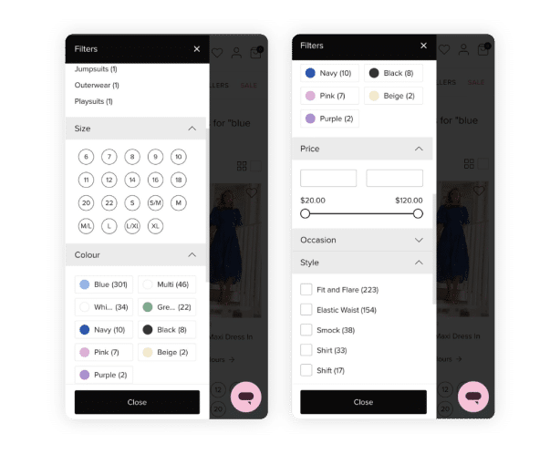
Image: Aje Athletica
Streamline the mobile checkout process
When shoppers are ready to checkout, make the process as fast and seamless as possible. If your customer has previously ordered from your brand, consider how you can pre-fill basic information such as name, email, contact number, and delivery address.
One-click checkout options, such as Shopify’s ShopPay, store a shopper’s payment and shipping information to eliminate re-entry of information when that buyer returns to your store. This process can make the path-to-purchase much faster, particularly for mobile users. Shopify also says that, according to its data, a one-click checkout option can lift conversion by as much as 50% compared to guest checkout.
For more ideas on how to increase mobile conversion, access your guide to Mastering Mobile Commerce in 2024.

From discovery to doorstep: nailing the post-purchase experience
All the way through a shopper’s first experience with your brand, they’re evaluating. They’re assessing how easy it is to find, discover, and order the products they want. Shoppers’ keen observations don’t stop at checkout, either. How you communicate, respond to queries, and handle processes like returns will form your customers’ opinion of the post-purchase experience.
Effectively turning one-time purchasers into loyal, repeat customers relies on meeting and exceeding expectations across a range of touchpoints. Here are our top tips to create an exceptional post-purchase experience every time—that drives loyalty and re-conversion.
Set the expectations up-front
Don’t be afraid to over-communicate your returns policy. Adopt a customer’s mindset and look at your website and communication points with a fresh perspective. If you were a first-time shopper, would you expect to see returns information on product display pages, checkout pages, dedicated returns, and Terms & Conditions pages? What are the ways you might look for that information? Think website footer links, FAQs, on-site search queries for terms like “returns” or “refunds”, and even live chat.
Additionally, consider how easy it is for customers to access returns information after they’ve placed an order. Could you include information about your standard returns period and approval conditions in your order confirmation and update emails?
Communicate—right up to your customers’ doorstep
The customer experience doesn’t stop at the checkout. Effective post-conversion communication can extend that experience, drive brand memorability, and encourage repeat purchases.
In a survey commissioned by Slickdeals, 63% of shoppers reported completely forgetting they ordered something online until it arrived at their doorstep. That means nearly two out of three shoppers may forget about your brand altogether during that time. For brands looking to turn first-time purchasers into re-converters, this can create serious issues.
Review your post-purchase communication touchpoints to stay front-of-mind with customers—right to the doorstep. Customers expect delivery status updates at various delivery stages. In fact, Körber 2023 State of Shipping and Returns Report reveals that 60% of shoppers want to know when their order is out for delivery, 58% when the order is received, and 51% when the order is delayed. Offer customers email, SMS, or app updates when orders have been released from backorder, picked from your warehouse or store, collected by a courier, almost at the destination, delivered, or delayed.
Make returns a reason to return
Seamless, hassle-free returns processes can significantly impact re-conversion. 76% of first-time customers with an “easy” or “very easy” returns experience say they would shop with that retailer again, according to Narvar research.
To make returns as easy as possible:
- Offer customers self-service pages where they can quickly complete return requests and gain instant approval.
- Give customers email and SMS updates on returns tracking, processing, and refund information to build confidence the whole way through.
- Make it simple for them to use live chat features, and when customers need help with more complex queries, make it quick to connect with customer service reps..
Lastly, explore ways to go the extra mile and make the returns process extra memorable. Instant refunds, such as those offered by Refundid, enable shoppers to receive their funds directly into their accounts—before they’ve even shipped their items back.
Leveraging loyalty and rewards programs to increase reconversion
The ecommerce industry is expected to hit a staggering USD $6.33 trillion globally in 2024, according to eMarketer. This figure represents a 9.4% increase over 2023 projections and indicates future stability in the global ecommerce market after a period of uncertainty. What does this mean for online retailers?
With growth comes competition.
As noted in Chapter 02, the cost of obtaining vs retaining customers can show huge variances by industry and brand. However, the Searchspring State of Ecommerce report shows that rising customer acquisition cost (CAC) is the #1 challenge for ecommerce brands in 2024. As competition increases, so does CAC.
Fortunately, brands that effectively leverage loyalty and rewards programs can create a competitive advantage to re-convert existing customers and attract and convert new ones. McKinsey research notes that consumers are 10% more likely to shop with an organization with a top loyalty program and 14% more likely to increase the frequency of purchases.
Further evidence from Power Retail shows that rewards lead to a higher AOV and conversion frequency. 56% of shoppers say they have spent more on a single purchase because they are loyalty program members. A further 79% of consumers say they are more likely to purchase more often from a retailer with which they have a loyalty membership. The potential impact on conversion is immense. With that in mind, let’s dig deeper into how brands can connect with shoppers through loyalty and rewards programs.
Behavioral and emotional loyalty
A strong loyalty and rewards program should focus on behavioral and emotional loyalty’s psychological principles. Shoppers form behavioral loyalty from repeated purchases of preferred products or favored stores. For example, a customer might always buy printer ink refills from the one store they’ve always used. Emotional loyalty relies on shoppers’ feelings towards a brand or online store. This type of loyalty continues to work even when a program doesn’t offer financial incentives. How can you build emotional loyalty into your programs?
Reward customers in cost-effective, fast, and favorable ways
The simplest way to build emotional loyalty into your programs is by creating authentic connections. These bonds come from understanding your customers and delivering what they want, time and time again. McKinsey notes that brands offering the right tangible and experiential benefits can create profitable customer engagement from their programs.
McKinsey survey data shows:
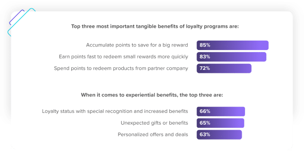
Do your rewards offers enable shoppers to accumulate points quickly, save for big rewards, and spend points with partner companies? Also, consider whether free shipping works for your rewards structure; BigCommerce data shows it’s the number one favored type of reward, at 80%, followed by automatic discounts on all purchases, at 57%, and the ability to redeem points for products, at 56%.
Additionally, think about how to personalize the rewards experience. Are you currently showing customers offers your brand wants to promote—or what your customers will love based on their previous shopping behaviors? Brands can enhance the emotional connection and reward shoppers by showing more relevant offers, including early access and sneak-peaks of new products. Extending this personalization strategy across your site can further build those connections as customers explore additional products beyond the rewards catalog.
Refrain from flying blind with rewards programs
Do you know how long it takes for your average shopper to accrue and cash-in rewards? BigCommerce reports that 56% of shoppers are deterred by programs where rewards take too long to accrue, while unappealing benefits turn off 52% of them. Review how long it takes customers to build up their rewards and the quality of those offers.
The same data also shows that 64% of consumers report high program costs preventing them from using or joining a retailer’s loyalty scheme. If your program has a joining fee, it’s a good idea to periodically survey your shoppers to understand their expectations of reasonable costs.
Lastly, make sure customers have visibility of your program. 24% of consumers who shop with a given brand—but do not participate in that brand’s loyalty program—stated that they were unaware that a loyalty program existed.
Look for opportunities to promote your rewards programs across your site. In-line banner images are a compelling way to promote rewards and offers as customers browse or search through items. Social media, SMS, and email flows, including new sign-ups, reminders on order confirmations, inclusions in packaging materials, and dedicated marketing emails provide additional ways to make your rewards program more visible—and drive continuous conversion.
Keep the momentum going with long-term conversion strategies
Retailers face emerging challenges in 2024, though the apparent stabilization of ecommerce globally means they can shift focus from combating uncertainty to seizing opportunity—and there are plenty abound.
The Searchspring State of Ecommerce report revealed that 67% of retailers think AI-enhanced personalization presents the biggest opportunity right now.
A further 50% of respondents in the same survey experienced the most success in the year prior by improving conversion. This is unsurprising, given the global ecommerce conversion rate sits at only 2.58%, according to Adobe. When competitors are pulling out all the stops to attract traffic to their sites only to deal with low conversion, think about how a seemingly minor lift in conversion rate could make your brand the leader of the pack.
Throughout this article, we’ve covered critical conversion strategies and valuable tactics—from enabling the right shoppers to find and discover the products they love to re-converting after the checkout.
Download your in-depth eBook to take these strategies with you and keep as your reference to help elevate your website conversion rate in 2024 (and beyond).
