Decision fatigue is an all-too-real concern for online shoppers. Fortunately, category filters help shoppers narrow down options and find what they’re looking for – even if they don’t know exactly what they want yet.
What Are Category Filters?
Category filters, also known as facets and product filters, are an ecommerce navigation tool that enables shoppers to narrow down the products they see on category pages based on specific criteria. These filters usually include attributes like size, color, and brand, but can also be customized for the types of products you sell.
Why Are Category Filters Important?
Category filters are the unsung heroes of the merchandiser’s playbook because they help customers find what they want, faster.
They help shoppers narrow down options by criteria such as size, color, and brand. These filters eliminate the need to scroll through irrelevant products and reduce distractions on the path to purchase.
Filters also help reduce decision fatigue, which boosts sales. A study by Columbia University found that when customers experience decision fatigue, they buy less. Researchers set up two displays of jams at a grocery store: one that showed 24 jars of jam, and another that exhibited only six. While more people stopped to look at the larger display, it only led to a 3% purchase conversion rate. The smaller display led to a 30% conversion rate.
Best Practices for Ecommerce Product Filters
Here’s how to take advantage of filters to help shoppers find what they want faster and encourage them to complete the checkout process.
1. Use the Goldilocks Principle
Just like presenting too many products overwhelms customers, excessive category filter options also slows them down. Take inspiration from children’s story heroine Goldilocks and A/B test category filter options to find the sweet spot – not too many and not too few.
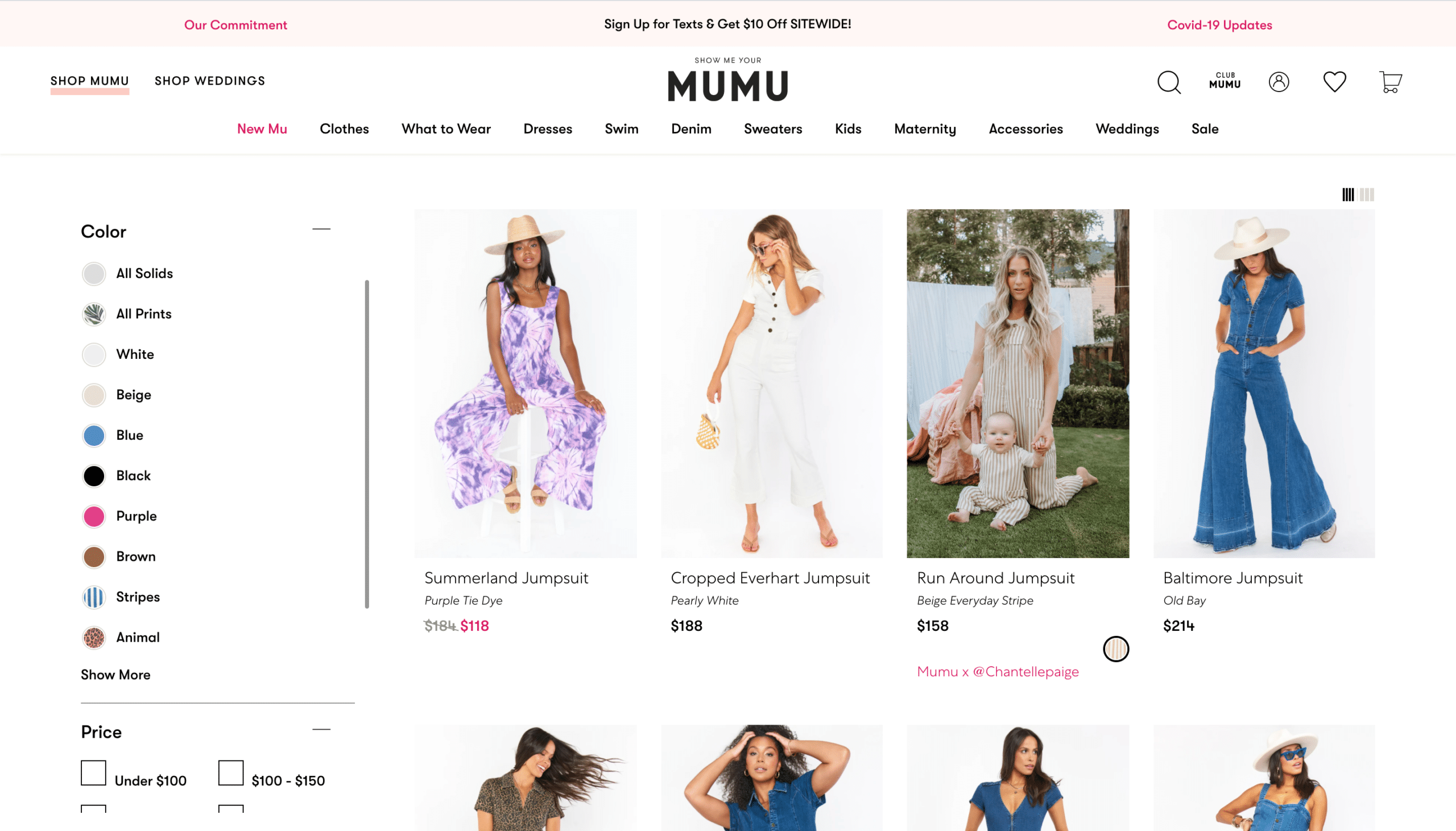
See how fashion brand Show Me Your Mumu strategically chose to not include every color possible under their “color” filter? Instead, they feature the most popular shades and let the customer expand the options.

2. Make Product Filter Options Intuitive
There are many ways to present category filter options to customers. Checkboxes, a range selector, a dropdown, images, and more. Do your customers a favor and make the shopper experience as easy to use as possible by using ecommerce filter navigation options that make the most sense for the category. For example, use checkboxes for sizes and brands, a range selector for prices, and swatches for colors.
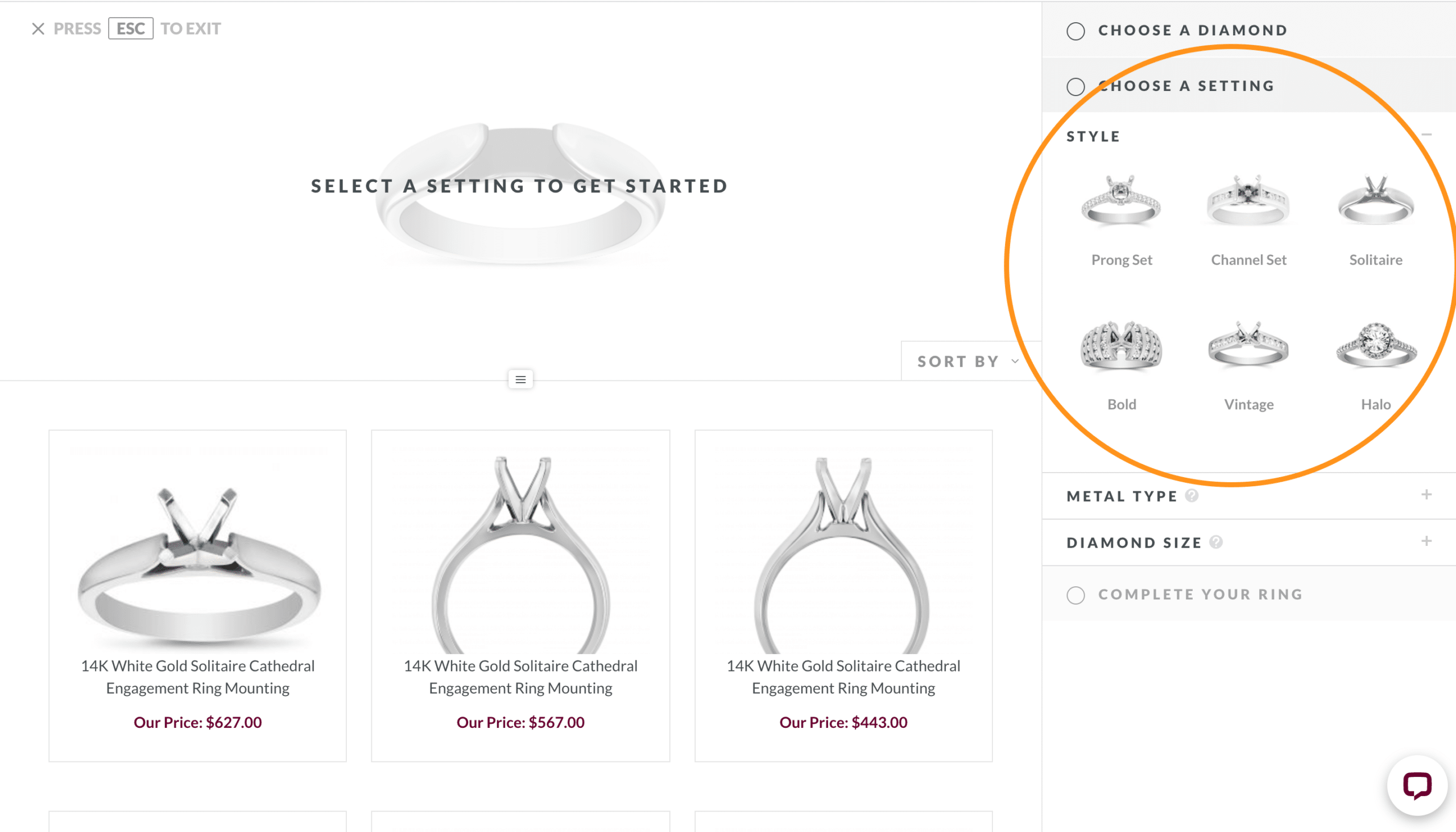
Borsheims makes faceted filtering intuitive in their ring builder by including images in the category filter options to help shoppers distinguish between different ring settings.

3. Hide Irrelevant Filters
Irrelevant filters distract shoppers from what they really want or add confusion to their search. Configure category filters to hide options that don’t have anything to do with the products on the page.
For example, let’s say you run a fashion store that sells both clothing and shoes. Sizing filters that appear on the shoe category should be very different from sizes that apply to pants. Suggesting that shoppers select their waist measurement when shopping for sneakers is not going to inspire confidence in your website or brand.


