This guide is designed to help online retailers optimize their category navigation in hopes of making it easier for shoppers to find what they want.
We’ve consolidated dozens of tips from our web developers, customer success experts, and customers into this guide.
Section 1: Top Level Category Navigation
Your top level navigation is extremely important. Most (if not all) of your visitors will interact with your top-level navigation options during their visit.
Tip 1: Simplify
Are there redundant items that could be removed? Is there a smarter way you could organize your categories to make them easier to use?
Tip 2: Merchandise
Since top-level categories are usually very broad, they’re likely to contain large numbers of products. Merchandising these broad category pages can improve the shopping experience. Placing on-sale, popular, or highly rated products at the top of these categories could improve the experience. There are many other merchandising opportunities to explore.
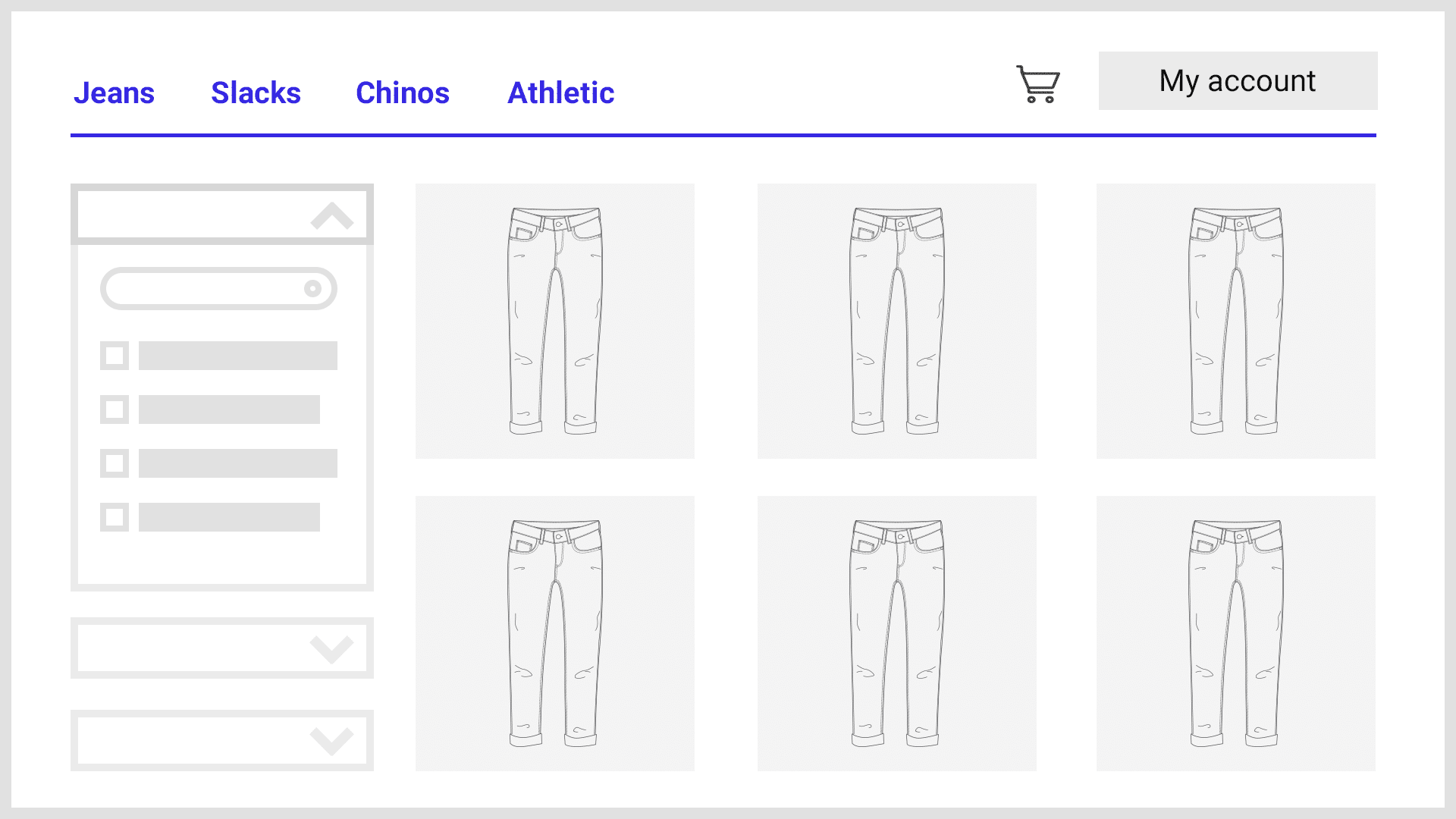
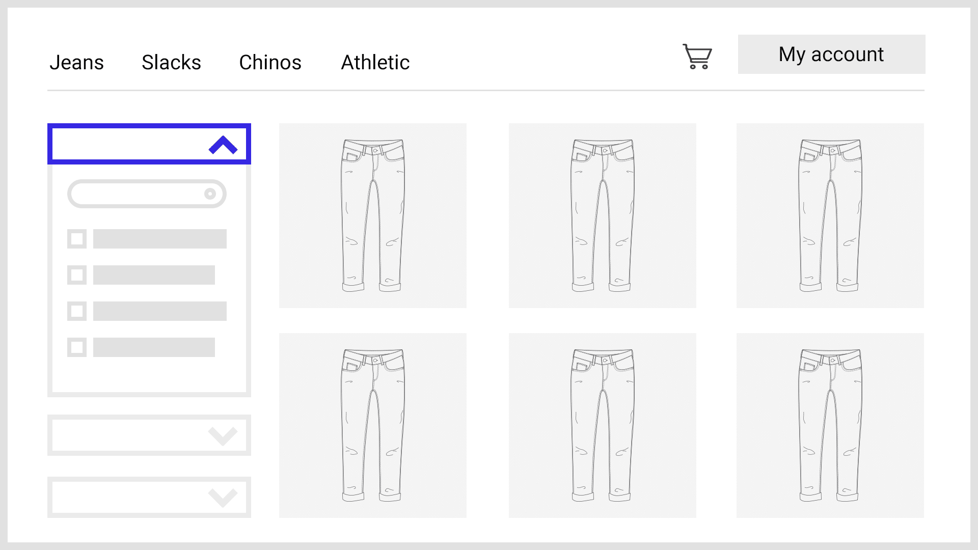
Section 2: Ecommerce Filters
Filters save shoppers from a lot of scanning and scrolling. Providing filtered navigation helps your visitors by:
- Allowing them to navigate based on what’s important to them.
- Enabling them to visualize their navigation path.
- Providing them with an easy way to “back out” of a selection without affecting other refinements they’ve already made.
Simply providing filtered navigation options increases conversion rates by an average of 20%.
Tip 1: Allow shoppers to search for ecommerce filters
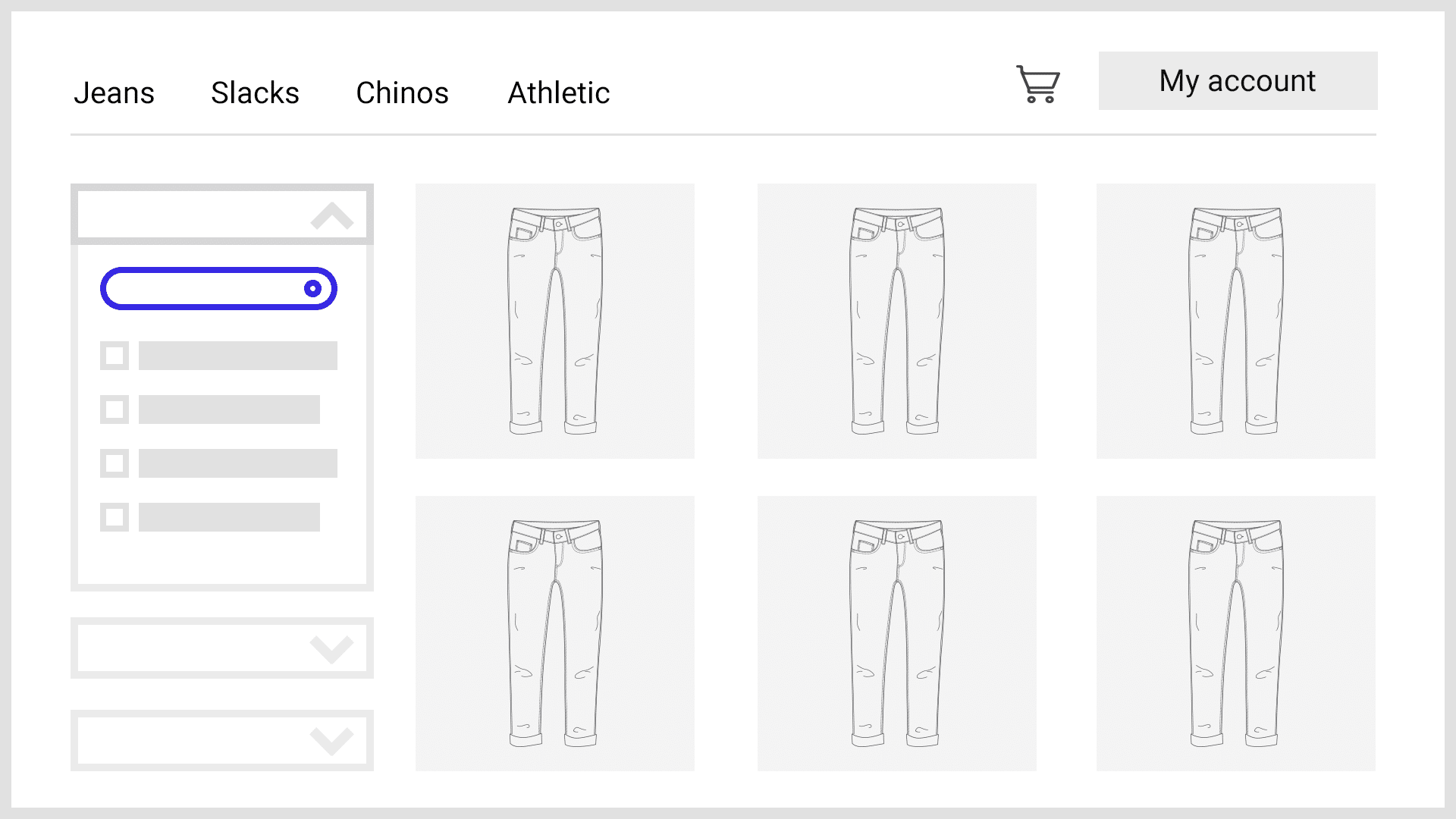
Stores with hundreds or thousands of products may have dozens of relevant filters for a given category or search page. Allowing shoppers to search for the filter they want can help them find it much faster.
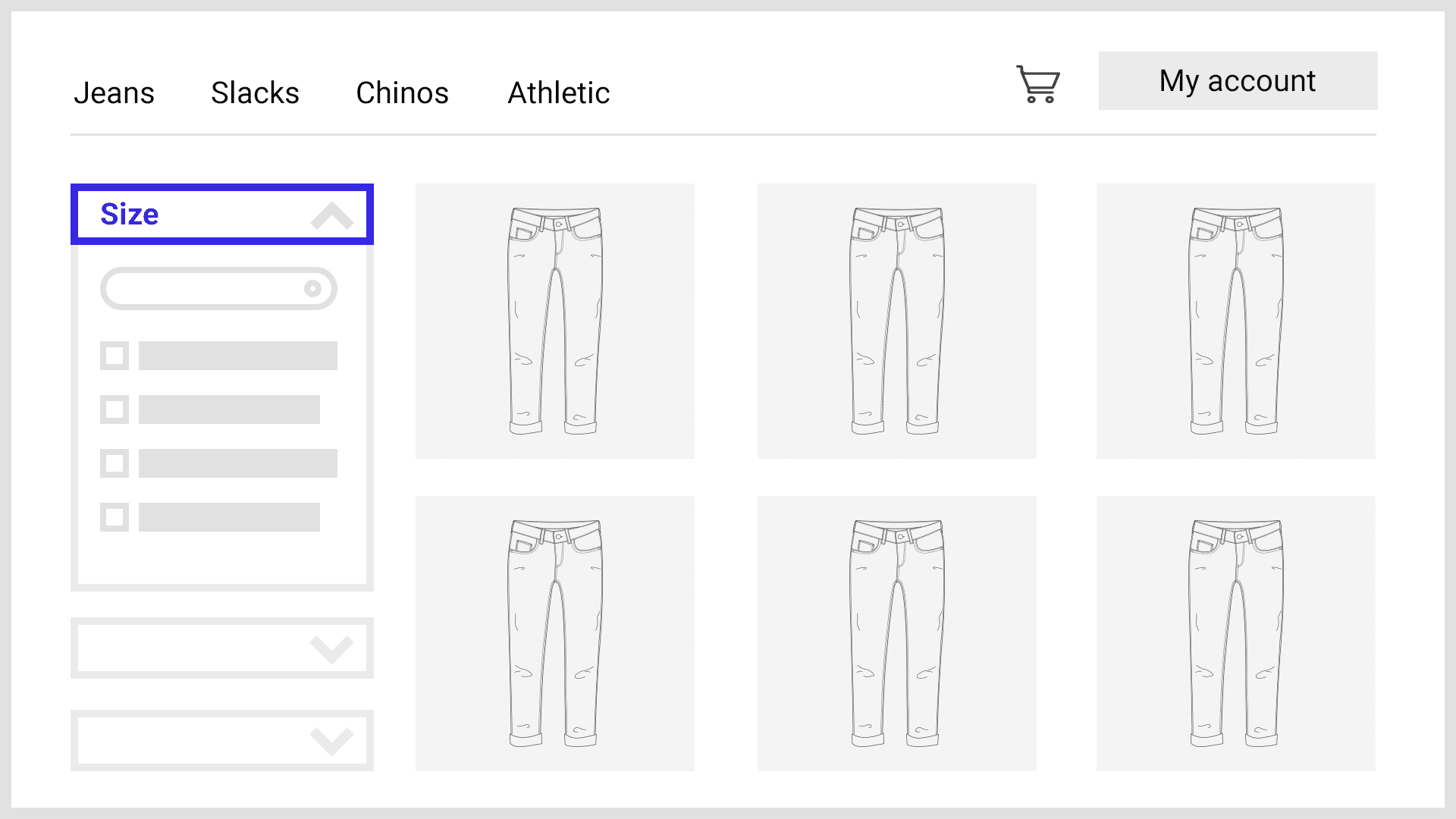
Tip 2: Add an Expand/Collapse Option for Filter Groups
Stores with larger product catalogs may have several filter groups. When all of these groups are expanded by default, most users will not see many of the groups. Provide the option for groups to be expanded and collapsed for easier navigation.
Tip 3: Expand Only the Top 3-4 Filter Groups by Default
While collapsing all filter groups will prevent users from seeing any ecommerce filters, expanding all of them will make navigation much more difficult. Expanding only a handful of filter groups at the top is usually a good compromise.
Tip 4: Place the Most Popular Filter Group at the Top
While the most popular filter group will change depending on the category, placing the most popular filter group at the top will help shoppers find the most relevant filters. For example: Apparel retailers should usually place the “size” filter group at or near the top, while the filter group for “brand” should probably be near the bottom.
Tip 5: Add a Scrollbar or a “Show More” Button to Filter Groups
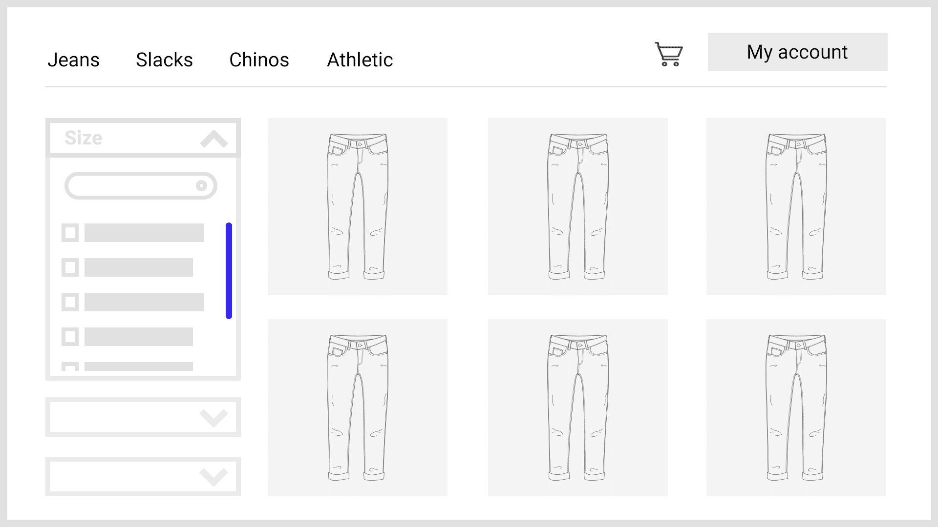
Provide a scrollbar or “show more” button for filter groups that contain more than a few ecommerce filters so users can easily access all of them. This prevents a particular filter group from being so tall that it makes it difficult to find and use other groups.
Tip 6: Use a Grid or Palette Display to Save Space
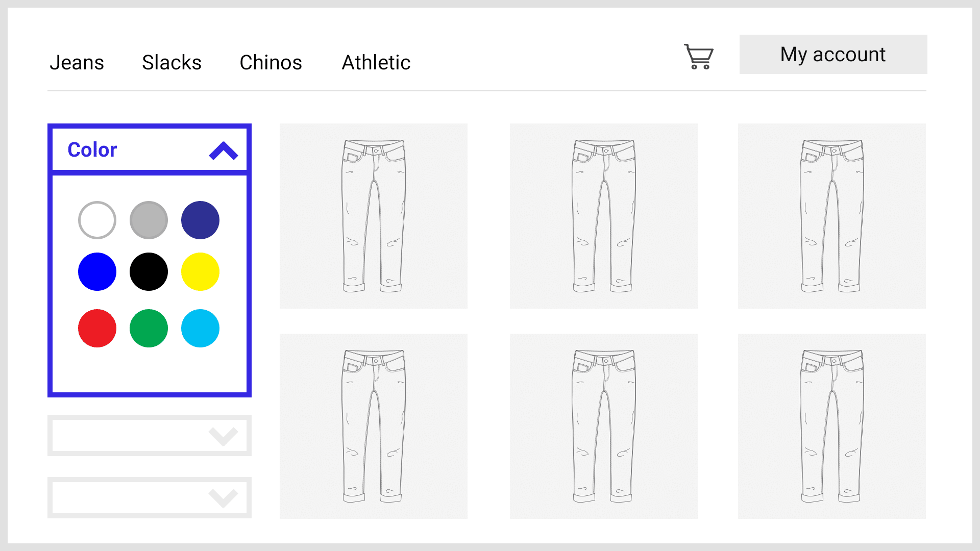
A grid display saves space by utilizing the horizontal pixels that are typically left empty. For example, this can be used for the size or color filter groups which are standard on fashion and apparel stores.
Tip 7: Use a Price Slider
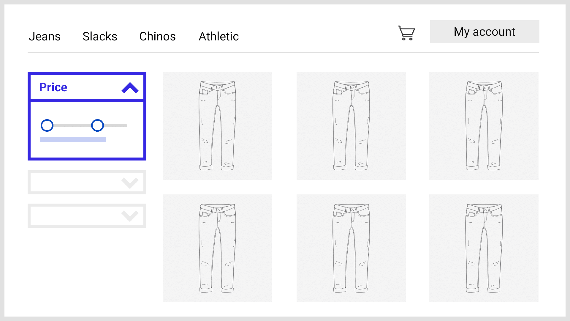
Sliders are much more optimal than the standard list view for selecting price, allowing users to set a customized price range much more quickly.
However, on mobile they can be more difficult to use. If you want to use a slider on mobile, consider the following:
- Implement larger touch targets
- Place the price UI above the slider, rather than below
- Provide input boxes for manual entry


