The small-but-mighty ecommerce search bar is a critical tool in helping shoppers find the products they’re looking for, quickly. Although search boxes are significant drivers of revenue, retailers often pay little attention to their design, placement, and features. Unfortunately, this oversight can lead to significant missed sales opportunities.
The good news is, it’s never too late to optimize your search bar. Implement these ecommerce search box tips, sit back, and watch the sales come in.
Embrace Top, Front, and Center Placement
One of the central tenets of good website design is simplicity. Your shoppers shouldn’t have to think about where to find the search bar – its location should be intuitive.
Put your ecommerce search bar in the most obvious spot: at the top, front, and center of your website. This placement typically sees higher engagement from customers compared to top right or left placement.
Make Your Ecommerce Search Bar Stand Out
Don’t go crazy by experimenting with funky color combinations, use a white background inside the search bar to make it stand out on the page.
And if your website’s background is white, make the search bar pop by outlining it in a contrasting color.
Display Your Search Bar Loud and Proud
If you don’t want to make money, the best thing you can do is obscure your ecommerce search bar. Search bars that are hidden or displayed on flyout menus see much lower engagement from customers.
If you want your shoppers to find the products they love, add them to their carts, and place orders, you have to make the search bar a key element of your website design.
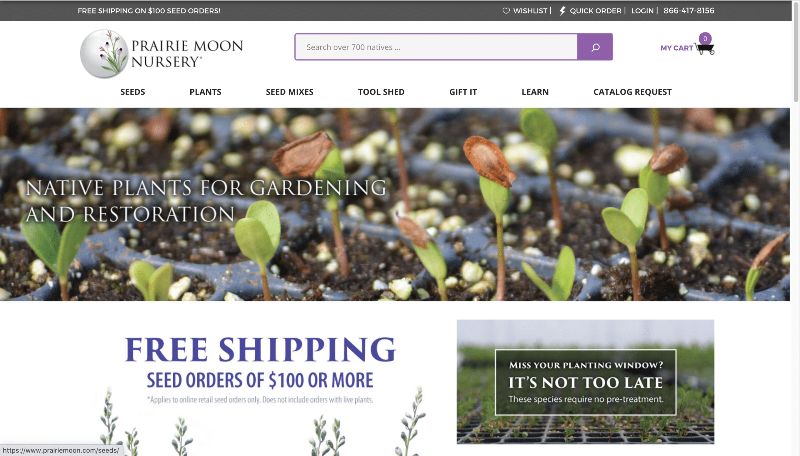
Prairie Moon Nursery does this masterfully by incorporating our first three best practices into its search box. It’s located at the top, front, and center of the website, it stands out thanks to a white background and a contrasting purple outline, and it isn’t hidden.

Add a Search Button
While the magnifying glass icon is an almost universally recognized symbol for search, some shoppers may still seek out a “search” button they can click after inputting their query, rather than hitting the enter key. Depending on your audience, this button and call to action (CTA) combination could increase your search usage.


