
Our top ecommerce product discovery strategies

We’ve been watching and learning from our customers over the past ten years. In this short and sweet guide, we want to share a few tips and tricks we’ve picked up that will help you to improve your ecommerce product discovery on your online store.

Chapter 1: Product Finders

In many industries, the product finder widget is easily the best way for shoppers to find exactly what they need. Shoppers love this feature, but are you using it correctly? Could you be getting better engagement from your visitors by making a few minor adjustments to how it works?

Tip 1: Make your finders available everywhere

product finders

The location of the product finder is incredibly important,  but a lot of automotive sites make it frustrating to use from the shopper’s perspective.

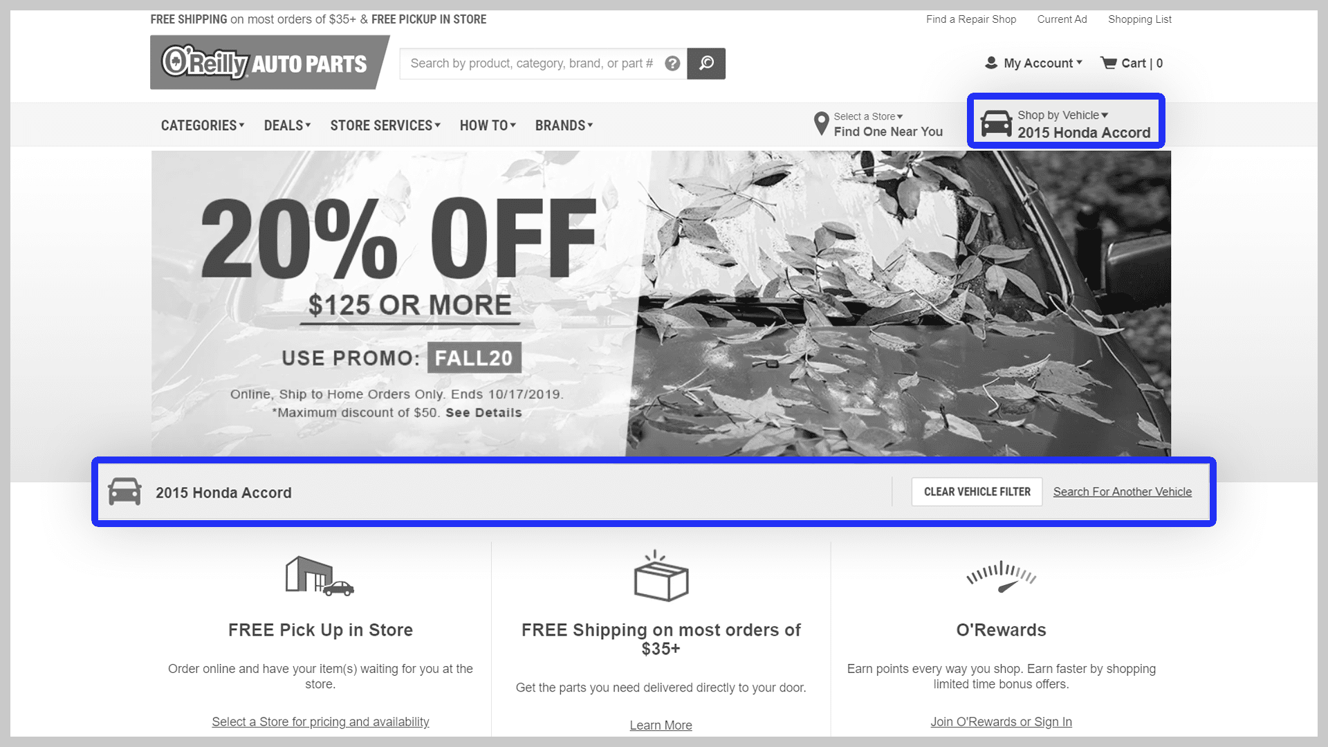
Let’s take a look at AutoZone. As a shopper, I find it frustrating that I can’t find the product finder on the homepage. Obviously, it can only be helpful if your visitors can find it. That said, AutoZone probably tested this, and may have a reason for doing things the way they do.

autozone

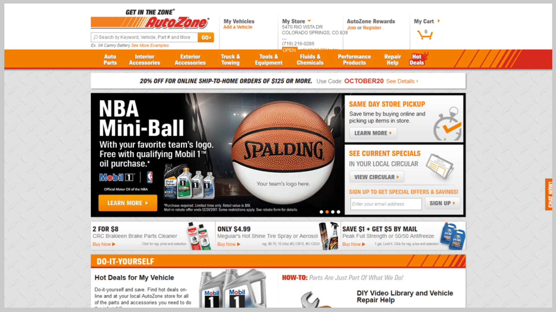
Since they don’t have a product finder anywhere on their homepage, how would you go about finding a headlight assembly for an Audi A4?.

You could search, or browse through the categories, but both of those options are likely to result in pages that require further refinement. They do have an “Add a Vehicle” link that will give you the finder, but that’s rather hard to see.

As a matter of fact, after our test search, AutoZone did return a helpful page. But the fact remains that further refinements are needed to find what we need. We will either have to browse using one of the categories in the left sidebar, or by clicking one of the images in the center of the page.

By placing the parts finder in the header, we can determine accurately what vehicle the visitor is shopping for early in the process. This also means that we don’t have to rely on the user’s spelling, or in their providing all of the details necessary. If, for example, the user types “A4 headlight” we know the model and a broad category, but don’t know the make or the year.

auto parts finders UX

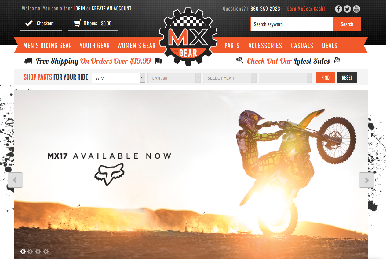
MXGear places the product finder front and center on the homepage. Their setup is slightly different since they sell parts for various types of vehicles. But the concept is solid. Here, they ask for the type of vehicle, the make, the year, and then the model.

Once the shopper clicks “find”, they can select exactly what they need for their vehicle.

auto parts finders UX delivers helpful and relevant products

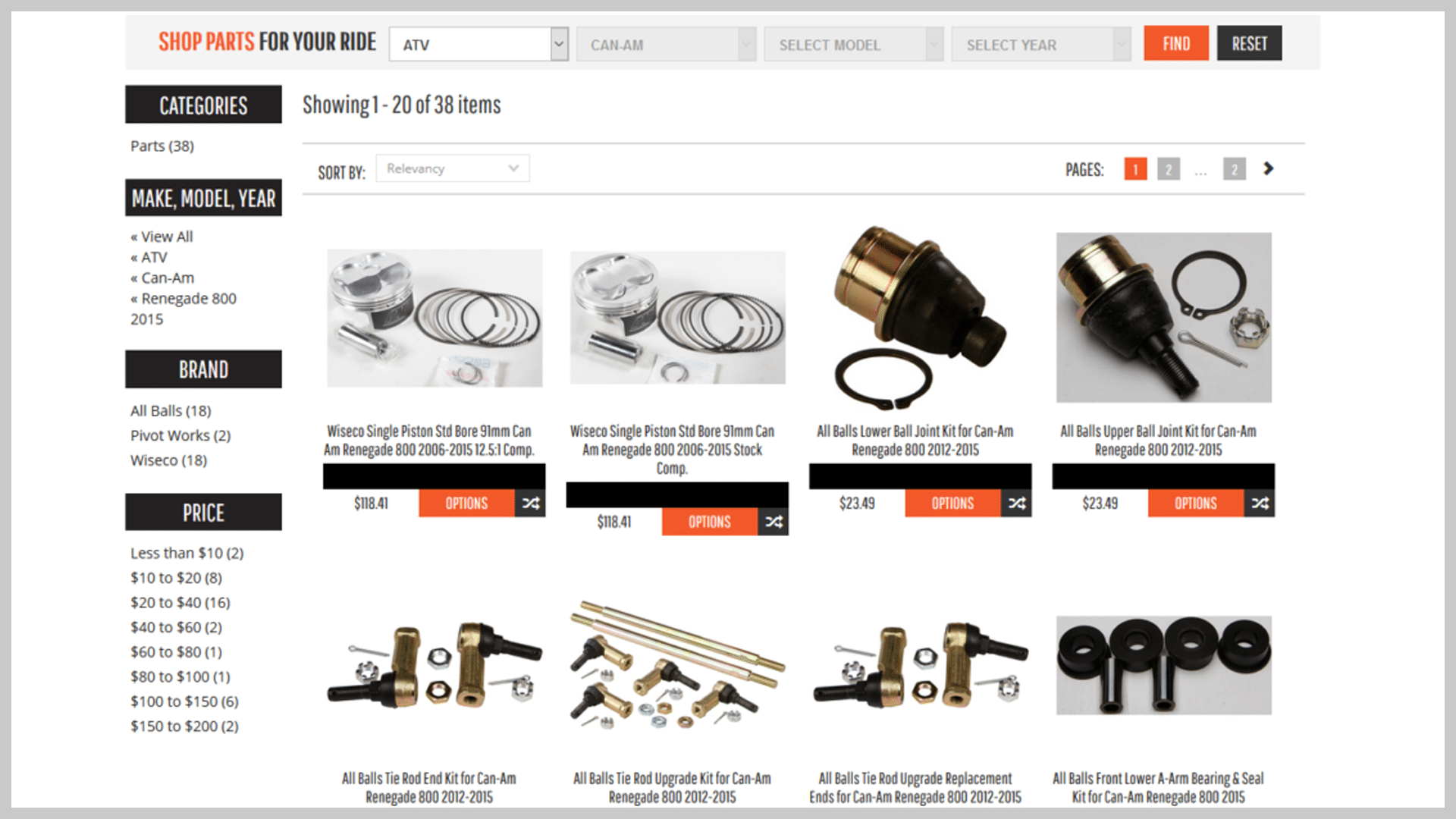
Along the left side, they have controls to filter down to the specific type of part that they need. Granted, this setup works great for MXGear because they don’t sell parts in dozens of categories. Regardless, placing this feature in the header where it will be available on every page allows you to gather more information about the customer’s needs early on, and in our testing does improve ecommerce product discovery and increase conversion rates in sessions where these finders are used.

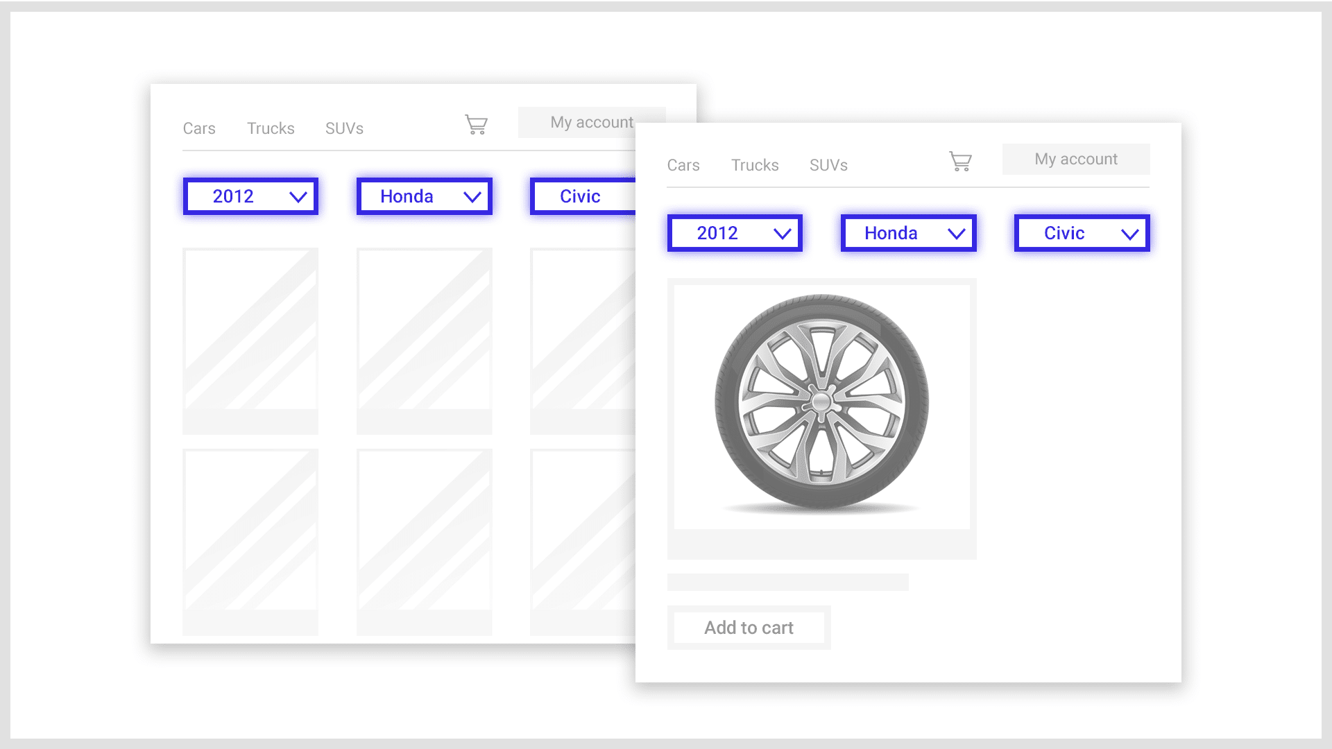
Tip 2: Display recommendations live

On many sites with product finders, little or nothing on the page updates after making selections in the drop-down menus. This strange behavior confuses shoppers. Many of them might wonder if the feature is working without visual confirmation.

Tip 3: Display a “my garage” section

automotive store

Many major auto parts and accessory retailers are adding a persistent “my garage” section in the header.

A “my garage” or “my vehicles” section is a helpful to shoppers in a number of ways. For one, it assures them that you know which vehicles they own and are shopping for. It can also encourage account creation which will help with the checkout process, marketing, and much more.

Tip 4: Add an indicator of vehicle compatibility

compatibility indicator ecommerce product discovery

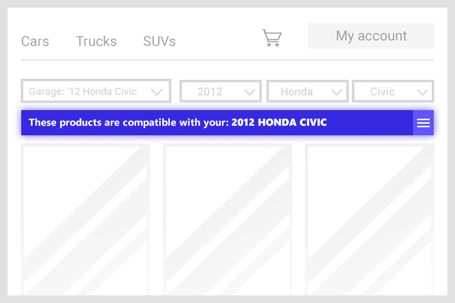
A UI element similar to the example in the image above will assure users that the part or parts they’re viewing are compatible with their vehicle.

Place this on:

  • Results pages
  • Category pages
  • Product pages

Webinar: Black Friday Follow-Up: Black Friday is Over, Now What?

Chapter 2: Data management

Product finders, search, and merchandising are all heavily reliant on your product data. Unfortunately, data in the auto industry is particularly complicated. Below are a few tips that are universally helpful for ecommerce product discovery.

Tip 1: Work with your solutions providers

Your solutions providers will each have their own unique formatting requirements. Get in touch with them and find out how your data needs to be formatted to work best with their service.

Tip 2: Normalize synonymous terms

ecommercce product discovery

Searches for “chevy” and “chevrolet” should return exactly the same set of products, but if your data isn’t formatted properly, it won’t work this way.

If some products don’t have the word “chevy” in their structured data, shoppers won’t see them in results when they search using that word. These variations need to be normalized, particularly for search.

Tip 3: Normalize your dimensions

dimensions on an auto store

There are many different ways for shoppers to type out the word “inch”. How will your search fare when a shopper uses in. or the symbol instead of inch? Normalizing these variations in your structured data can be a monumental task, but it’s worth it in the end.

Tip 4: Normalize your fitment data

fitment data on an auto store

Fitment data can also be formatted in many different ways. Having this data normalized will help your finders, search, and even category navigation to be consistent and accurate.


Chapter 3: Guided Selling for Ecommerce Product Discovery

What is guided selling? As a concept, guided selling aims to educate and direct shoppers to highly relevant products through a series of choices. It has many applications and comes in various shapes and sizes. From our client Borsheim’s ring builder, to Canon’s lens selector, it can help you learn exactly what you want, while simultaneously generating a selection of products that suit your needs.

Below are a few tips to make your guided selling tool great.

Tip 1: Educate your shoppers

Use the questions you ask to introduce the shopper to important concepts, and educate them.

  • Teach them about the subtle differences between the products you sell
  • Familiarize them with important terminology

As an example of how this can be done, one of Canon’s first questions in their lens selector asks what kind of portraits the shopper wants to take. Some new photographers might not know that some lenses perform posed portraits better than others.

It gets more complex from there, and asks if they want to be “amongst the action” or if the shopper plans to “stand back”. What they’re trying to determine here is the focal length of the lens that the shopper needs, but they don’t assume the shopper knows these terms or understands how they’re important in this context. So instead, they ask questions about the shopper’s use case.

Tip 2: Provide context to your questions

In the next example, we have created a mock up of a phone store that wants to guide shoppers to phones that suit their needs. If you had never owned a smartphone before, you might not know about the consequences of choosing a larger or smaller screen. In that case, a salesman in a physical store would be able to explain that phones with smaller screens generally have smaller batteries, but are easier to hold. This kind of information is important to buyers, and should be presented so they understand the consequences of the decisions they’re making.

Tip 3: Provide context to your recommendations

Modern shoppers are automatically distrusting of brands they have little experience with. Most of your shoppers will default to assuming that your store makes profit-motivated decisions. With that in mind, it’s important to provide some information with your recommendations as you don’t want shoppers assuming you’re suggesting that they buy products that benefit you most.

Tip 4: Display recommendations live

Typical guided sales funnels wait until the shopper has finished answering questions to display a list of products. However, if your primary concern is conversion, providing a sampling of recommended products that updates as the shopper makes selections can be extremely helpful.

They may find a product that fits their needs anywhere in the process, and decide to move on immediately. This also helps with the trust aspect, as they can see exactly what effect their selections are having on the ecommerce product discovery process.

Tip 5: Use images

Canon’s example is also an excellent one when it comes to illustrating the differences between the choices on screen. Countless studies have shown that images have much higher engagement than words. With a quick glance, images can tell the shopper a lot more than a block of text.

  • Use images to illustrate the differences between options on screen
  • Provide images with each series of questions

Imagine you’re a furniture retailer. How many words would it take to explain the difference between bonded and top-grain leather to someone unfamiliar with the terms. Wouldn’t it be much easier to show a close-up image of the two materials?

product imagery

Tip 6: Optimize the UI/UX

Generally speaking, the purpose of these guides is to help the shopper find suitable products, not to survey them.

  • Use most of the screen real estate to show suitable products
  • Provide sorting options
  • Show 10-20 products per page

Many of these ecommerce product discovery tools make the mistake of using up too much of the screen to ask questions and display images, leaving little or no vertical real estate available for actual products to be displayed.

This is an area where Canon’s tool could possibly be improved.

Canon’s approach is common, but makes it very hard for the visitor to see the products they’re searching for.

However, there may be a method to this madness. Canon updates the products each time a shopper makes a selection. Perhaps, filling the screen with products too early in the process would distract the visitor, and prevent them from going through necessary questions.

This may not be the right answer for everyone’s ecommerce product discovery, though. In Canon’s case, the shopper has no way of knowing which of the lenses on the very first page suit their needs. But if you’re selling couches, the shopper could see something they like after only 1 or 2 questions.

In any case, by the time the shopper reaches the end of the guide, most of the screen should show products and provide intuitive navigation controls. While the style and color should be honed in by this time, it may still be helpful to have sorting controls for price.